Zack Atkinson
by ColinTierney • Uploaded: Oct. 22 '12 - Gallerized: Oct. '12
Description:
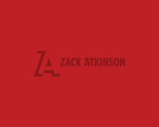
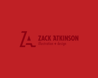
a logo for an illustrator and designer. he wanted a simple solution with his initials. the monogram consists of a 'Z' (positive) and an 'A' (negative). there's also a pencil somewhere in there. this is a WIP as i am still trying to understand his style so his personal logo can correlate with his work. so far, he likes the monogram.
As seen on:
Colin Tierney Design
Status:
Client work
Viewed:
10957
Tags:
a
•
z
•
monogram
Share:
Lets Discuss
lovin it!
ReplyI would keep the triangle a solid color in your alternate image. But I think it\'s wonderful.
Replymaybe bump up the "illustration design" ???
ReplyI also think you can enlarge the MAIn type to top and bottom of the counter of A.
Replyall excellent suggestions and exactly why i chose \'actively seeking critiques\'. i\'m just going to get rid of that variation for now. mike, good call on the counter. thanks for the gallery.
Replywaiting for your update :)
Reply37 seconds...
ReplyGreat, Colin. Just great.
ReplyYou have good clients! :D GoodWork!
ReplyThis is probably the first monogram I\'ve seen (and like) that combines both 3 and 2 dimensions successfully. Great work Col!
Replyvery nice!
Replynice play there, great one Colin!
Replymilosz, ricardo, chan, gary and florin...thank all of you gents. mike, waiting for your response ;)
ReplyLike typography!
ReplyPERFECT! Great work Colin!
ReplyNicely done, Colin. SOLID!
ReplyColin, I prefer the revision. I think for 1. it's easier to read. 2 The line weight works nice with the mark IMO.
ReplyRevised version - Better balance between monogram & typography. Tagline type could use a little more beef though :)
Replyalena, peter, thomas, mikey, mike and josh, thanks! mike, i agree and am pleased with how this is turning out (even better, zack likes it as well). thank you for your input. josh, yup you are right...went from a sirloin to a porterhouse. appreciated.
ReplyTasty :)
ReplyGreat implementation
ReplyBrilliant Colin!
Replyjosh, edgar and dan, thanks doooods.
ReplyNice!
ReplyGood job! I agree, not sure about the \"illustration design\"...
Replymarcin & fred, thank you both. fred, i did fix the tag line, but perhaps you\'re right. i\'m going to go without it for now. thanks.
ReplyFantastic work!
Replythis is masterful
ReplyClever, buddy!
Reply^ he\'s back!!!
Replyoh and thank you luka and ehsaan for the kind words.
ReplyHey, Colin! Trying to get back in, good to see you!
Replyyou too sean, looking forward to seeing some of your new works on here.
ReplyBeauty ^^
ReplyPlease login/signup to make a comment, registration is easy