egg
by nido • Uploaded: Oct. 05 '07 - Gallerized: Oct. '07

Float
(Floaters:
95 )
Description:
clothing range for newborns...
As seen on:
egg
Status:
Nothing set
Viewed:
23924
Share:


Lets Discuss
Took me a second to figure this one out, but very cool Nav. Does the wordmark lose it's character if you connect the egg shapes with vertical lines to show the lowercase g's a little more clearly?
Replyme too %3B)*superb
Replyi like it, congrats!
Replythanks guys... **@ocularink.. yeah bud, tried that %26 it did kinda lose the egg shape, it just looked like stylized lowercase 'g's**@smartinup.. thanks.. you sound like my wife lol
ReplyWell, it's egg-cellent nevertheless.
ReplyHey, that's cracking mate!
Replyreally?.. or you egg-zaturating?
ReplyNo yolk. Eggceptional work.
ReplyI don't think it needs any lines added- great as is.
ReplyNido, while I love the concept, I think you could provide us with another eggsample. take it from an eggspert LOL (joke).
ReplyEggseptional concept.
Replyyes, I like it, just think the eggsecution could have been perfected on the g's.
Replythanks peeps... what do you mean egg-zactly logomotive?
ReplyLOL! ok I don't think you need to show the entire outside lines of the eggs if that makes sense. In other words design the g's to resemble more g's by losing some of the oultine detail. The eye will make out the rest.I just know you can improve what you currently ahve, that's all.
Replyi think it's pretty neat right now. **if it wants to be eggcentric then really go for it. i get the feeling this logo isn't sure what to do yet. it wants to be quirkier, but is restraining itself somewhat. **i'd really like to see more iterations of this concept. scramble it up!
ReplyThis represents 'eggs' more than 'egg' :%5EP
Replyegglicious... nice one dude..%0D*
ReplyHey nav, just a thought bud. how about one of the eggs with a crack, like you know, about to hatch. cheers mate.
Replywhy is everyone cracking egg jokes? :p
Replythank you everyone..you all make good points... I'm trying to keep this really simple!.. i don't want it to get too clever %26 at the moment my main priority is that you read 'egg'.. not 'e88'.. which no one said so cool.. %26 it's too late to try %26 say it now.. i don't count.. **peace, love.
Replyyou guys became too much eggocentric with these jokes, shame on you
Replygee.. thanks climax!
ReplyI’m egghausted reading all these comments…great design buddy!
ReplyThis is great, saw it right away. genius.
Replynido - great job - I will drink a kegg of beer for you !
Replyreally eggy and out there! nice one!
Replyegglicious!
Replyfun fun fun. GREAT WORK!
Replyextra...extra...extra...
Replyjust flawless... I hate you too %3B-)
Replynido, awesome work. Seems like a %22duh%22 idea, but I would have never thought of that.
Replysweet
ReplyIts so good it had to be 'poached'! Now we must end all the egg jokes for good! Good job!
ReplyYeah, it's getting beyond a yolk!
Replytime to eggsit
ReplyLOL!!! What have I started?! Good one, Raja. :-P
Replythanks to you Kevin we all have egg on our faces... **when will it all end... oh well, you cant make an omelet without breaking a few eggs.. **yes im trying to end it all now!
Replywowwweeeee, like this one i do
Replyegg
Reply...stinct
ReplyI%B4d prefer red color
Replyhmmmm ... something about the e is playing on my head .... great mark ... just a note ....
ReplyGreat, i love your logos.
ReplyThis logo meggs me smile every time I see it.
Replyperfect! Simple and too the point. And without the gradient it would be much less appealing.
ReplyThat eggcites me :-)
ReplyI remember seeing this when you first uploaded it. It's one of my favorites - thanks for your critique on my logo!
Replyhaha.. thank you guys %26 gals...
Replysigh... this has been selected for logolounge 5 too.. there.. i said it!
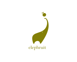
ReplyCongrats Nido! I hope that 'Elephruit' will be there 2!
ReplyI'd buy some clothes for my son :)
ReplyEggceptional.
ReplyWell in New Zealand I'd say %22I would like my eggs well done%22 and this certainly is!
Replythank you fellas :)....
Replynew fan http://lonuska.deviantart.com/art/eggs-logo-152087088
Replythis logo got feature of the month on %22logonest%22:http://www.logonest.com/2010/02/egg-2/ ...
Replywhat a shame, nido :) congrats, terrific idea!
ReplyAAрутDBе DFйца!!
Reply@ ru_ferret... lol.. %26 thanks**@markbrand... I hear ya brotha... I hear ya...
ReplyWhoooaa, awesome!
ReplyPlease login/signup to make a comment, registration is easy