MB
by milena • Uploaded: Aug. 29 '12

Float
(Floaters:
9 )
Description:
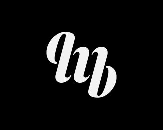
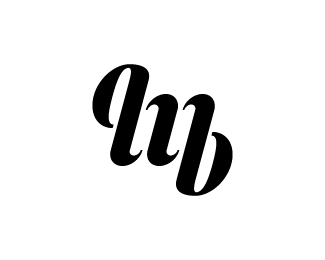
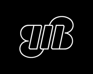
first attempt at a personal logo.
MB, my initials, as an ambigram.
Status:
Work in progress
Viewed:
9870
Tags:
personal
•
letters
•
typography
•
ambigram
Share:


Lets Discuss
I think would work better if it wasn't an ambigram. The part to the left of the M looks like it should be part of a letter, but isn't. If i was you, I would get rid of that part so it will read better.
ReplyThank you, Sam! You might be right, I'm stuck with this fixation to make it an ambigram, maybe I should just leave it behind. I'll test it!
ReplyI like it as ambigram. Seems more special to me. Also, it seems that your prior option was the poetics, the shapes, the legibility comes after. And then, when you realize you think: what a smart logo! =)
ReplyPlease login/signup to make a comment, registration is easy