Sound Partners
by misterjacobs • Uploaded: Aug. 12 '12

Float
(Floaters:
1 )
Description:
Sound Partners is a company that sales financial products. The name has a double meaning. The business operates near a coastline that has a large sound, a relatively narrow channel between two larger areas of sea or between an island and the mainland. They also want to invoke the financially safe or stable sense of the word as well.
We want to create a progressive mark that is simple and recognizable. Our goal is friendly yet secure, stable and comforting. They also like the imagery of wealth transfer from one generation to the next.
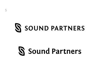
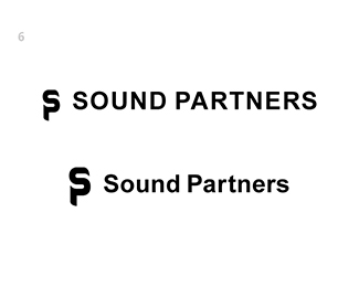
Logos 1 and 2 play on the nautical term of the word. Logos 3 - 5 are stylized S's. Logo 6 is a stylized S and P.
I'm not a big fan of all caps logos, but I decided to try it since it can convey stability. Of course I increased the kerning to "air it out" a bit. I also used a condensed typeface.
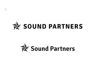
Logo 1. A nautical star that guides.
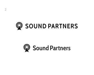
Logo 2. A highly simplified lighthouse that directs.
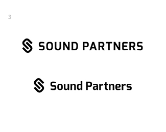
Logo 3. A bit more progressive interlocking S to convey a passing on of wealth.
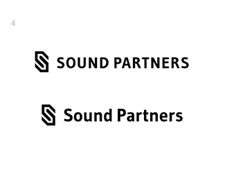
Logo 4. A more angular interlocking S, again to convey a passing on of wealth.
Logo 5. More of an humanistic interlocking S.
Logo 6. The S and P morphed together.
Status:
Work in progress
Viewed:
3205
Tags:
sound
•
Investments
•
Nautical
•
Star
Share:


Lets Discuss
Please login/signup to make a comment, registration is easy