ST04
by atomicvibe • Uploaded: Aug. 10 '12 - Gallerized: Aug. '12

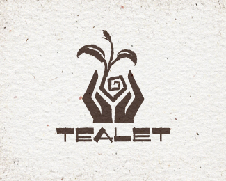
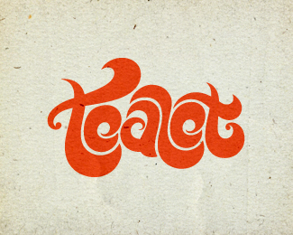
Float
(Floaters:
58 )
Description:
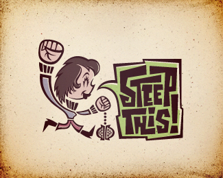
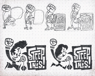
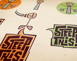
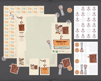
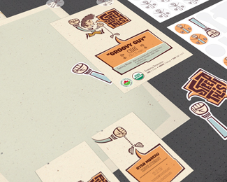
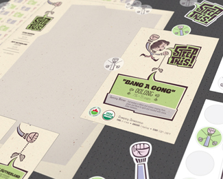
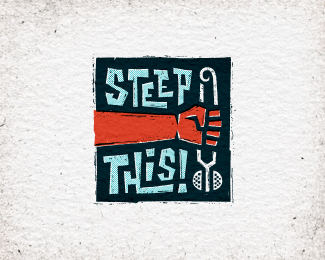
Chosen logo for start-up loose leaf tea company. The brand's values and messaging themes of freedom of choice & empowerment were heavily inspired by the U.S. civil rights movements of the '60s & '70s. Target audience: People who want to belong to a "tea scene" for like-minded individuals, but don't find themselves aligning with any of the current tea-drinking demographics, and are often dismayed by the negative stigmas surrounding tea. Tone: Should reflect the era, but avoid overly militaristic or psychedelic themes. Should portray boldness & strength, while still being fun, energetic, & youthful. Rationale: This character-based design is fun and energetic, and subtly alludes to the solidarity Power Fist gesture. The male character's over-exaggerated hairdo is based on that of James Dean, while his female counterpart was based on Jane Fonda from her mugshot taken in 1970: http://bit.ly/jf-powerfist. Unique, stylish characters are pivotal to this concept, and new ones will be developed for each tea type sold. The power of this concept lies in its versatility and expansiveness, as various secondary marks, icons, and graphic elements can be extracted and used throughout the branding suite. More info & images: http://bit.ly/dribbble-st04. Full case study: http://bit.ly/behance-st-case-study
As seen on:
Behance
Status:
Client work
Viewed:
9383
Tags:
fun
•
custom type
•
whimsical
•
green
Share:
Lets Discuss
This was the chosen concept!
ReplyStill voting for the first one! :D although this is interesting and congrats on finalising it!
Replygreat final choice in my book. should be a lot of fun in the branding possibilities here. Nice Jon.
ReplyCongrats, I love the hell out of this one!
ReplyCongrats Jon, great choice and a really wonderful project. Power fist!
ReplyGreat Work!
ReplyThanks for all the love and support, guys! Glad you're digging the end result. I really sold my client on the expansive branding potential of this concept, and I really can't wait to see it all come to fruition.
ReplyCongrats man you're absolutely right about the potential! Hard work always pays off.
ReplyDamn Jon...crazy presentation on behance. You are one hard working bugger...:)
Replyit's hard to decide which concept I like most, guess I love all of them!
Replymaybe this* version a little bit more...
Olivier, thanks man. And you're right, hard work does pay off!
ReplyNitish! Long time, man! Thanks for stopping by!
Szende, as always, I appreciate your feedback. Thanks for looking!
I've appreciated this at a few other places and now I get to appreciate it here. You know how much this one gets my branding mind spinning with the potential it has. Well done mate, this is some stella work that warrants a gold star made of the real stuff, not just the pixel kind. Congrats on all the features with this project.
ReplyGreat project again Jon, this is stellar work!
Reply@Matt, I really appreciate you being available to provide your feedback along the way. Always useful; always valuable.
Reply@Florin, appreciate you stopping by, man! Thanks for the comment!
For this absolutely atrocious effort you call design, I give you not one but two F's.
ReplyPowerful identity work!
Reply@Norm, Love ya, buddy! Hopefully those Fs stand for "Frigg'n" and "Fantastic"...?
Reply@Ameen, thanks for the nice comment!
Great work here Jon!
ReplyThanks a lot, Rudy! Really appreciate you stopping by.
Replyyes, excellent work!
ReplyGreat mark Jon!
Replythis also in my fav folder! :)
ReplyHopefully I can become as talented as you someday. Any advice? Awesome work!
ReplyClaude, Carlos, Hanuman, Evan, I truly appreciate you stopping by and dropping such nice comments. Thank you.
ReplyEvan, I\'m really flattered, man. Thanks. I do have a few pieces of advice.
First, continue participating in identity design communities like Logopond. Take part in discussions and critiques, and study the work of top posters and featured designers. Ask questions, and really try to understand the mechanics of good logo design.
Second, sketch. A LOT. Great logos come from great sketches. Period.
Third, great logos achieve a symbiotic balance between imagery and type, so you should familiarize yourself with the mechanics of type, and really strive to master typography. Creating custom type, when relevant, is a great way of ensuring your work is completely unique.
Fourth, practice, practice, practice. Here on Logopond, members can upload fictional work done just for fun. Concocting your own hypothetical companies, and designing logos for them is a great way to sharpen your skills and to get recognition from your peers. Also, many logo book publishers and awards contests accept fictional work, so the better you get, the more chances you have at getting your work published and recognized by not only other designers, but clients as well.
And finally, get yourself a bunch of logo design books. Viewing stuff online is great (and easy), but nothing beats a nicely designed book at your fingertips. A few examples of great logo design series include Letterhead and Logo Design, LogoLounge, Logonest, and I Heart Logos.
Good luck!
Please login/signup to make a comment, registration is easy