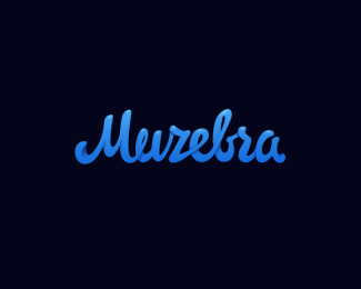
Muzebra
by ArtyomYa • Uploaded: Aug. 02 '12
Description:
music site
Status:
Client work
Viewed:
4104
Tags:
lettering
•
muzebra
Share:



Lets Discuss
I really like the flow to the cursive overall, and your subtle overlap shading & highlights add just the right bit of dimension.
ReplyI realize you're not seeking critique, but there's only one area that could use improvement. Your Z totally reads as an R. Have you tried a Z that looks like this:
http://oi48.tinypic.com/jgkyom.jpg
This style of cursive Z is made to have both its begin- and end-strokes connected to surrounding letters, whereas the style you chose does not naturally do so. And when you try, it causes some legibility issues.
Just something to think about. Otherwise, this looks great!
atomicvibe, I agree but must say that the logo is made for the Russian website, and English script letters are not so detailed. Moreover, the client wanted to emphasize the word "zebra"(music zebra - muZebra), that's why it was the choice.
ReplyThanks for your feedback.
Please login/signup to make a comment, registration is easy