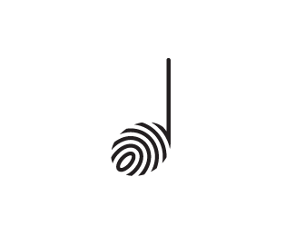
It's hard to define where each letter starts & ends, maybe if the line weight changed between them it would make a clearer separation i.e J bold, B light, N bold.
^ Thanks for the comments and I completely agree. As a result we've both agreed to explore a different route where the focus won't be on the initials but more on a symbol. This render you see now wouldn't have been the logo artwork itself for this concept, but more a mock up of how it would be used on wood. This project is for a woodcraft company and so it's important to see how it would look engraved or burnt using a branding iron into wood. Back to the chopping block :)


Lets Discuss
only B :)
ReplyV B A V or V B V
ReplyInteresting. Thanks :)
ReplyVIBAU
ReplyURAV
ReplyThanks for all the guesses. Back to the drawing board me thinks :)
Replya trojan zebra
ReplyK
ReplyIt's meant to say JBN, but looks like I'm going to have to buy a new piece of wood :)
ReplyGareth, I really love the concept and the technical execution, and with a little bit of tweaking, I think you can get this to work.
ReplyIt's hard to define where each letter starts & ends, maybe if the line weight changed between them it would make a clearer separation i.e J bold, B light, N bold.
Replynice concept. while the texturing looks nice, not sure of the lettering.
Reply^ Thanks for the comments and I completely agree. As a result we've both agreed to explore a different route where the focus won't be on the initials but more on a symbol. This render you see now wouldn't have been the logo artwork itself for this concept, but more a mock up of how it would be used on wood. This project is for a woodcraft company and so it's important to see how it would look engraved or burnt using a branding iron into wood. Back to the chopping block :)
ReplyJ B V. But no doubt this looks very interesting Gareth.
ReplyMy initial thought was NBN actually. It looks really, really cool.
ReplyPlease login/signup to make a comment, registration is easy