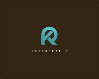
Q Photography
by wolv • Uploaded: Sep. 27 '07 - Gallerized: Oct. '07

Float
(Floaters:
48 )
Description:
Elegant Q for wedding photographer. a Q ring (update no sparkle)
Status:
Nothing set
Viewed:
49896
Share:


Lets Discuss
I really like the overall look! Suggestions:- Take out the 2 glare elements in the Q (they aren't serving any purpose), possibly make the leg of the 'Q' thinner, it looks too thick! I might centre the text below the 'cirlce' shape also.**Really nice logo!
ReplyThis is beautiful. I kind of agree with 90degrees90 on the sparkles... unless they serve a special purpose. Everything else I think is perfect, including the alignment of the text. I absolutely love the triple meaning of the symbol. Perfectly executed!
ReplyGreat symbol and typography but doesn't need the effects.
Replynice overall, no need for the extra sparkles etc.*The shadow looks a little odd, does it need it?*
Replyim liking this too.. %26 i kinda like the sparkles...
ReplyVery elegant... I also agree, the sparkles are a nice touch but a little distracting from the overall feel of the design
Replywow, i didn'nt expect such comments. thank you all, all the inputs are very valuable and i mean this is my first real client. thank you very much all :)%0D*%0D*i think the sparkle is cool, i mean it's a wedding photographer and in my vision a wedding is something beautiful with sparkly thing like magic. and not much logo have a sparkle effect in it. you're right about the shadow, a little odd, i think i can take them out.%0D*thanks all
ReplyNice!*I agree, I don't like the sparkle either, but the concept and execution of everything else is great.
ReplyWhile I think the sparkles add a unique touch to it, something about them seems out of place. Could you try playing around with them and trying different looks? If you don't think you can change the sparkles I would honestly leave them in%3B they set this logo apart from the rest. I think this concept is wonderful.
ReplyP.S. I also think the gloss really adds to it.
Replythanks erik,.. updated
ReplyIn the word's of the great Borat...%22VERY NIIICE!%22
ReplyI love this mark even more without the sparkles. A camera lense, ring, Q, P and yet so damn simple!
ReplyFirebrand, you missed the film roll!
ReplyHaha, so I did!
ReplySo many hidden secrets. Sweet!!
ReplyHey, this up again :) thank you guys, i didn't notice there were so many secrets .. lol :) it was intended to be a Q ring, but an extra is always a good thing :)
ReplyI like it a lot. You have done a great work. %0D*%0D*But text under Q should be centered. The rest is just perfect
Replydoesnt look like a Q but it looks great anyways
Reply@icu: it does centered, with the tail altogether.**@wheedwacker: it has all the features of the letter Q**thanks for the comments :)
ReplyElegant!
ReplyGorgeous mark. I like the odd balance. Really nice.
ReplyWait... so the film roll wasn't intentional? That's the first thing I saw, and I thought it was the most brilliant representation of a film roll that I've ever seen.
Replyhehe, it's not intentional :)
ReplyNice logo %26 I like the sparkle. Nice logo.
ReplyI was just looking at this again. It also reminds me of the advance knob and shutter button on my old film SLR. I think that's six different interpretations now. What a great mark!
Replygr8 logo nice work
ReplyPlease login/signup to make a comment, registration is easy