PIL 2
by designer • Uploaded: Jul. 16 '12 - Gallerized: Jul. '12

Float
(Floaters:
49 )
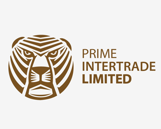
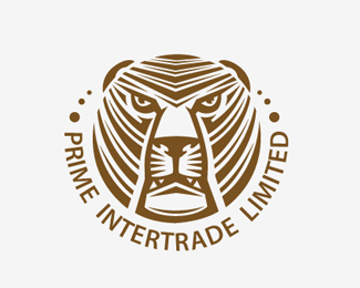
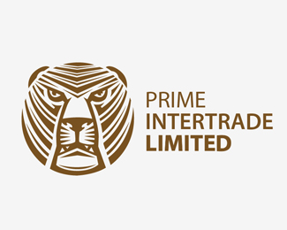
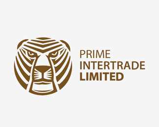
Description:
Logotype for intertrade company.
Version 2
Status:
Work in progress
Viewed:
9895
Tags:
tiger
Share:

Lets Discuss
I like the more aggressive version of the eyes and the mouth semi-open. great work.
ReplyThankyou Rudy
ReplyOrange form is more big interesting)
ReplyWow its strong!
ReplyThanx! )
ReplyAlways a suckers for lions. Love it
Reply^ You mean tigers?
ReplyLiger? =P
Replycat.
ReplyBear.
Reply@tabitha Napoleon?
Just stating I like lions is all ;)
ReplyLion or tiger - no difference ) cat is cat
ReplyNo difference? haha. Silly. =P
Reply^ I had a feline someone would say that :)
ReplyI love this! The woodcut look is great. I wonder if a more grotesk sans serif font may look more 'old world market' than modern humanist Frutiger/Myriad. This is really great!
ReplyTop quality!
Replyawesome illustration
ReplyPlease login/signup to make a comment, registration is easy