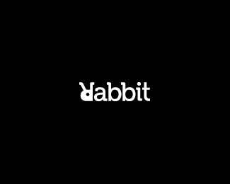
Rabbit
by ColinTierney • Uploaded: Jul. 10 '12

Float
(Floaters:
59 )
Description:
© 2011 Colin Tierney Design
As seen on:
Colin Tierney Design
Status:
Just for fun
Viewed:
3956
Share:


Lets Discuss
wth? how did i get a float without a view? weird.
ReplyBecause it is THAT good :) Tricks are for kids! Nice one mate.
Replynever thought of flipping it upside down. But it works, I can read it just fine.
ReplyNice!
ReplyNice indeed. Have you tried with the Museo font? I think it would fit nicely here:) Also, maybe the dot on the "i" could be the same size as the eye...
Replythanks for the comments guys. rokac, the 'i' dot is the same size as the eye of the rabbit. it must be that whole negative positive space illusion. also, excellent suggestion for the font choice. i will be back in a few with a variation update.
Replyupdate. variation 1 the 'R' is modified some and variation 2 the 'R' is left as is within the font. i would love to hear some thoughts on these. thanks.
ReplyNice work son, i am liking the new font a lil better. More of a fan of variation 1 , the serif on the top of the R is coming across a lil odd, at least to me
Replythanks man. i'm with you, i like variation 1 the best.
ReplyDef, the serif either way. Gives it a folded ear feel.
Replyyeah, i agree. i'm going to stick with variation 1. thanks mike and thanks roko for the suggestion.
Replynice idea!
ReplySimilar to this,
Replyhttp://en.wikipedia.org/wiki/File:Rabbit-Logo.png
Looking good Colin;)
Replythanks all. i appreciate the comments and floats.
Replygreeeaaaat , perfect ,
Replyhossein, thanks and good to hear from you buddy.
ReplyGreat rabbit!
Replythank you alena. btw, love your new avatar! fits your work perfectly.
ReplyDone before : http://www.youtube.com/watch?v=J59n8FsoRLE
ReplyVery nice idea, b&w version is more cool.
ReplyPlease login/signup to make a comment, registration is easy