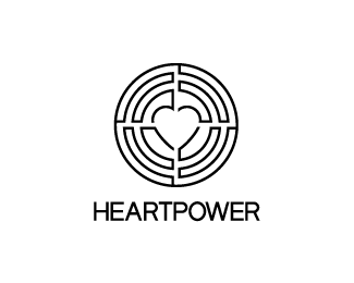
Heartpower
by downwithdesign • Uploaded: Jul. 06 '12

Float
(Floaters:
8 )
Description:
A lifestyle/career coach.
The concept is based upon the idea that Heartpower helps their clients to find their heart to realise their true potential. The logomark is made up of four continuous lines which symbolise the four sections of the sacred circle. It could also be portrayed as a maze or a filament which could hint towards the fact that the heart has slight electrical energy hence it's power. There are also four hands which subliminally form the image of the heart. This could symbolise teamwork (four hands = two people = the coach and the client).
The brief detailed that if a heart was to be utilized in an icon then it should not be portrayed in a romantic way, but to symbolise the core power of the heart within each and every one of us.
As seen on:
Coming Soon
Status:
Client work
Viewed:
4128
Tags:
trust
•
coaching
•
black
•
gold
Share:


Lets Discuss
Thanks, I think so too. Updated to the final palette.
ReplyLove the non-gradient version best Gareth!
ReplyThanks Rich, I agree. Client doesn't though, unfortunately.
ReplyPlease login/signup to make a comment, registration is easy