Lumiga
by milena • Uploaded: Jul. 03 '12 - Gallerized: Jul. '12

Float
(Floaters:
42 )
Description:
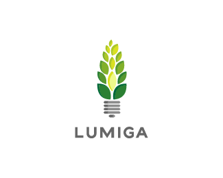
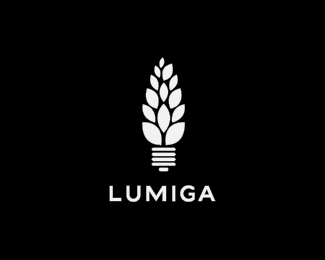
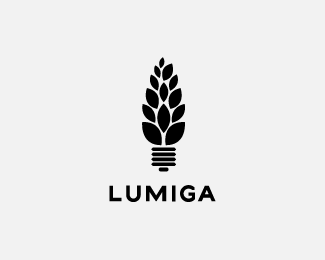
For a green company that sells energy projects (lighting). The word "lumiga" means "to brighten" in Esperanto.
Status:
Unused proposal
Viewed:
11570
Tags:
environmental
•
lighting
•
light
•
green
Share:


Lets Discuss
nice!
ReplyThis is great! I love the clean lines and the shape of the mark.
ReplyThanks, guys!
ReplyVery nice work! Clean and really says what they do. Love Gotham (the new Helvetica?). Looks like the piece translates to one color well!
ReplyI would consider having less leaves OR making a little more space between them (just a smidge), so when it is sized down, the leaves will still be visible/articulated. Same goes for the base of the bulb. Maybe even make them angled to make it feel a little asymmetrical?
The kerning for "LUM" needs just a touch of attention.
All in all, tight and solid!
Thank you, herbyderby! You have some very good tips, all taken note of, but since the client went another direction, I'll just leave it be for now...
ReplyI just realized this logo has logoponds colors hahahaha nice
Replygreat idea, nice shape and typography.
ReplyThank you, Daniel!
Reply@David: It does! hehe, that was totally unintentional
Please login/signup to make a comment, registration is easy