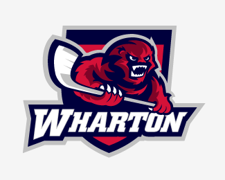
Boston Bruins Concept Logo
by mattkauz • Uploaded: Sep. 21 '07 - Gallerized: Sep. '07

Float
(Floaters:
71 )
Description:
A concept I made a while ago. It's made it's way around the web a little bit, so I thought I'd post it here...
Status:
Just for fun
Viewed:
30736
Share:


Lets Discuss
AWESOME! Loving the bear illustration especially. Just enough detail without being overdone. It's perfect. **Easily one of my favorite logos on this site. Kudos!
Replyoh yeah.. this is awesome mate.. go Boston!
ReplyPerfect.
ReplyGood to see some other CCSL Boards Alum on here. I love this way more than their revamp this year!*
ReplyWhen I first saw it I thought it was another one from logomotive.%0D*%0D*Icon, type,colors etc. everything's great here.
ReplyAmazing, I love that icon!!!
ReplyThanks everyone... About 90%25 of my portfolio is sports related, so you can probably expect more of the same kind of stuff in the future...**I have an ongoing series on the CCSLC Board called %22Rebranding the NHL%22. You can see what other teams I've done along with uniforms, alt. logos, etc... I'll eventually end up posting them here when I get around to it.**Matt*
ReplyI think nidos %22Baby Bears%22 could take him LOL!. hey Nice work my friend.
ReplyVery well done, very strong... love it!
Replyooooooooh yeaaahhhh
ReplyI love the mark...incredible work...perfecto:)
Replyheck yeah. great stuff.
ReplyAWESOME! Seriously one of the best sports logos I've seen.
ReplyThis is awsome!!!!!
Replyvery nice... bear illustration is AWESOME!
ReplyReally, really nice! I'm a New England born Bruins fan and this logo definitely does them more than justice. Really nice concept. If they took this on as their new logo, I would have no objections. GOOD WORK!
Replyawsome AND amazing. Its the bear. The lights and shadows makes it exciting.*The typo speeks the same language as the illustration.*GORGEOUS.
ReplyThis is Awesome!! do you have a website at all? or somewhere to contact you? I'd love to talk to you about your work.
ReplyI love this logo. Excellent mix of realism and stylish interpretation!
Replythis is awesome!
ReplyIf this was implemented, it would be by far one of the best logos in the NHL.
ReplyGo Habs Go! %3BP
ReplyOne of my favorites of all times from the 'sports section'... :) This is an evergreen logo!
ReplyPlease login/signup to make a comment, registration is easy