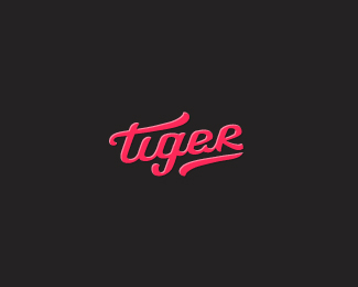
Tiger
by milou • Uploaded: Jun. 12 '12 - Gallerized: Jun. '12


Float
(Floaters:
77 )
Description:
Hand-made typography based on a lot of sketches (that's because Fibre Brush Pens were included), then some modifications in vectors.
Status:
Work in progress
Viewed:
10282
Tags:
tiger
•
typography
•
type
Share:


Lets Discuss
super! lubie takie :)
Replywielkie dzieki Michal, tak w ogole to jestes na Dribbble?
ReplyNicely done.
ReplyThanks Steve.
ReplyMilosz, you logo tiger, you:)
ReplyHehe, I like tigers you know. Thanks my friend.
Replysome beautiful looking type work Milosz.
ReplyCongrats Milou!
Replylooks great! The "e" character looks a little odd for me.
Replynice type Milosz !
ReplyPieknie! 'R' wyszlo bardzo ladnie!
ReplyMilosz, nie mam tam konta :)
ReplyNice to see some new work Milosz and congrats on gallery. as mentioned.... loving that T crossbar and the continuity it has with the underline. sexy stuff.
Replyclassy letters
ReplySuperb typography Milosz but honestly, i don't like the 'e' there. Rest is very well balanced.
ReplyMike, David, Ricardo, Vencel and Norbert, Bernd, Maciek, Matt, Alena, Ali - Thanks, it's a pleasure to hear ya all!
Replyvery nice, r reminded me of sapphire logo you made some time ago :)
ReplyBy the way, what does the company do?
cheers!
Hey Julius, yeah it may be slightly similar (I'm looking at those two R's right now), but my Saphire's has the leg differently placed and much longer ;p It was done for small design & development collective. Cheers!
Replydigging those r's, e's and whole type in both logos ;)
ReplyI'm glad to hear that Julius :)
ReplyThanks Thierry!
Replyyeah!
Reply"tiger on Tiger
ReplyOh, it's very cool :)"
^ Haha, thanks tiger!
Cheers Edgar!
Whoa, nice.
Replyflowly nice! :)
ReplySame story here, this logo design is also is in sale for $5!
Replycheck this link below:
http://fiverr.com/kylelogosuk
Thanks guys!
Reply@szende thanks for letting me know, it seems like he took it down.
that's rights hopefully stays this way (:
ReplyHaha yeah :) it's crazy that he was selling it for 5$, hope nobody bought this one for that much! Btw, I really like yr style and showcase.
ReplyPlease login/signup to make a comment, registration is easy