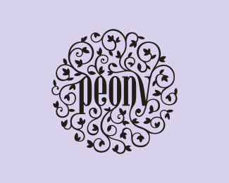
Peony
by midgar • Uploaded: May. 14 '12 - Gallerized: May. '12

Float
(Floaters:
76 )
Description:
Peony - the art of planning.
Organization of events and parties (weddings, business meetings, press conferences, etc.).
Theme: peony (flower), elegance, exclusiveness, class, discretion, trust, style.
Status:
Unused proposal
Viewed:
19228
Tags:
elegant
•
ruszel
•
event
•
midgar
Share:
Lets Discuss
great lookin! my opinion is that you don't need two colors here, one would do, amazing piece
Reply^ You were right, solid color is better. I had overdone it with shines and shades before.
Replylooks fantastic! wonderful balance. there's no awkward parts, everything fits just beautifully. I never saw the original two colour version but i know through a project i've just done recently that it's easy to commit yourself to doing shines and shadows, only to come back to the original solid colour version as being the best solution. great job!
Replyyea, looks def better this way,amazing job!
Reply@vergad
ReplyI rarely fall for any flashy effects in my logos, but this time I just kept going and going...
Some perspective and input from other designers is always a good reality check.
Thanks for the comments!
well you've nailed it with this version - deserves way more floats then this. if i had the power, i'd gallerize this in an instant. visually stunning, although one thing i guess i shouldn't overlook, is it is aligned way more to wedding events then business meetings/ press conferences. I can imagine the client would of needed something a little more neutral?
Replymissed it ... how could this be ?? ;D
ReplyCool!
ReplyPure Beauty..
ReplyI really enjoy this one! Those vines/flower are so well balanced.
ReplyVery nicely done. Event planning is an intricate business with a lot of things going on. I think the tendrils represent that well and all come together beautifully. Great concept too.
Reply@vargad
ReplyYou are right that the style of this project leans more toward weddings than business events. But that is what I intended. Not because their activity would concentrate around weddings, but because my client wanted a more personal look. Therefore, I tried to avoid sterile corporate feel and make it more organic. I also had in mind that the style of ornament implemented in the logo could be deployed on a wide variety of application, giving them a nice elegant feel and, at the same time, strong connection with the brand.
Great piece of art..just one thing comes to mind the " ELEGANT"
ReplyIts awesome!
Replyelegant, exclusive and classy with discretion..im looking for a logo design..would you be interested..?
Reply@chaitan74
ReplyPlease contact me via midgar.logo@gmail.com or lucaruszel@gmail.com.
pure hotness
Replyyour designs are very beautiful.
ReplyIs this logo available to purchase?
Reply@autumnhorses
ReplyIt might be available. If you are interested, please contact me via:
midgar.logo@gmail.com
Please login/signup to make a comment, registration is easy