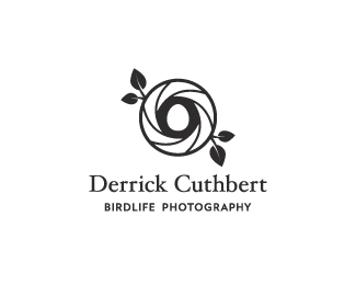
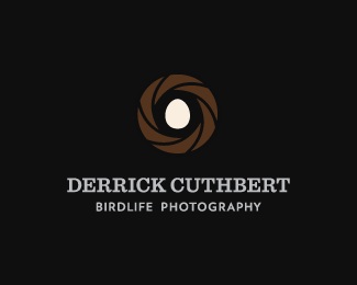
Derrick Cuthbert
by HayesImage • Uploaded: May. 13 '12 - Gallerized: May. '12

Float
(Floaters:
51 )
Description:
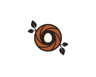
Derrick Cuthbert & team specialise in atmospheric photography of native birdlife for the purposes of educational resources i.e. encyclopaedia publication, etc. The mark is based on a camera shutter which doubles as a bird nest, highlighting the importance of 'within natural habitat'. The egg not only symbolises where to locate birds, but highlights the level of quality care Derrick & his team put into ensuring their presence does not damage or disturb the eco systems where they take their shots, as well as their adherence to the endangered species act. You could say they're so careful, they could cradle an egg. The foliage around the shutter/nest demonstrates the level of macro detail within the photographic prints.
Status:
Client work
Viewed:
16314
Tags:
shell
•
cream
•
brown
•
black
Share:


Lets Discuss
I was unaware that nobody was able to comment on this, which is a shame. Comments are now active (where they should be)...so have at it.
ReplyHi Josh I really like the layers of detail and rationalisation but the execution, for me, appears cartoonish for such a real-world, nature and atmospheric proposition. I don't think it communicates high quality or photographic experience.
ReplyThe union of an apature and a nest is certainly original but it follows the trend for compounding visuals and as such really only reflects the obvious (photography and birds) something you have already communicated in the strap-line.
I would loose the logo-mark and look at using the business cards to display (as a full bleed image on the reverse) some of the atmospheric photo's. I think that would really nail the proposition rather than an illustration.
Thanks for the honest feedback Richard. Really admire that instead of just saying "looks great Josh" you've actually had good long think. I completely understand what you mean, leave it with me :)
ReplyThanks again.
I'm really glad you took it as it was meant, it does actually look very good there's no question there.
ReplyI was imagining the atmospheric photo's and thought that it would be that aspect that would get me excited, decent photography is hard to come-by on freelance jobs in my opinion. The logo/logo-type could play a secondary roll perhaps communicating something the images could not (the personality of the photographer, his approach, price, etc).
The isolated logo-type is not likely to get the floats here but as a complete branding article (with stationary etc) on your website it would look neat.
Thanks for taking the time to write a reply and a decent project description.
amazing !!
ReplyLove this concept, man! I agree with CD about the 4 leaves and perhaps a variant between all of them would give some extra life there. Also, the type seems just a little weak in comparison to the strong mark. Maybe a sans serif for both could be nice. All in all, love this!
Replyvery very nice
ReplyAll good talking points, on a side note; haven't done any design work in/for the photography sector prior to this, photography-based logos are indeed a nice challenge.
ReplyI think the cartoonish feel stems from looking at it now (with fresh eyes & looking over all the comments) is that the mark is quite 'bold'...it does have that; shape, shape's outline - which shares the same mechanics as cartoon illustration.
With the leaves, again looking at it now, having them mirrored does make it look a little 'stock' as well as 'lazy' on my part. Some variation is needed & I think the stems could use some 'thickening' to blend better with the shutter.
With the colour tones as suggested by David, is it the 'flatness' of the brown that is giving it the toonish atmosphere? I was aiming for a realistic earth tone without resorting to textures and/or gradients, but perhaps it's a little thin.
Typographically, is it a line weight or proportion issue? Something I've put a lot of effort into recently is limit the amount of typefaces I use throughout my work i.e. Having a supply of 10-15 typeface families rather than 40-50 or more. Typefaces here are Hoefler Text (Headline) & Verlag (Tagline).
Thanks for the conversation all :)
I Think it's a clever concept, however if it were my personal photography business I'd like to see more of the 'Life of a Bird" more if that makes sense. But of course I did not read the brief.
ReplyI see what you mean Mike, there was something 'off' about implimenting a bird into this context...maybe it's the large amount of conceptual logos that play on the use of bird, feathers, etc. Granted the use of a bird in this context makes perfect sense, I think the use of an egg seemed to stand out more :)
ReplyNice tone David, currently giving the leaves & arrangement a re-think, will try out the tone too. Keep watching the variations panel :)
New variation added, I've removed the leaves completly & I've made some tonal, type & sizing changes.
Replyclever logo
ReplyThanks RaitG :) There'll be some further developments on this.
ReplyI love the concept, Josh. But I think the colors do injustice to the brilliance. The harsh bold and dark colors, especially the dark outlines probably gave the cartoonish feel as well. I'm not sure you need the leaves. I think it's best to leave the discovery of the "egg in a nest/camera shutter" after a longer glance at this logo. Looking forward to see the next round :-) Maybe focus on what atmospheric nature colors could be. Maybe hues of the sky? Since bird spend a lot of their time in the air? In my head, I imagine grayish or bluish, subtle hues. But I can be wrong too.
ReplyI just want to give you a support on this project. I have no doubt that this will be great in the end.
ReplyI think this is brilliant, though I echo the comments about the identical leaves. Very, very nice.
ReplyThis is a lesson! :)
ReplyInka: Interesting thoughts, I have been experimenting with atmospherics of late, although I think in doing so it looses the aperture angle a bit, but what I have put together so far is shaping up to be interesting. :)
ReplyJovan: Thanks for the support bud :)
samdemastrie: Thanks bud, yep the leaves are certainly needing some TLC.
ricardobarroz: That's great!! :)
I like the concept (although somehow I feel it does not say very strongly birdlife), in addition to the leafs update, i think the type could go bigger because for me feels a bit weak now in comparison to the strong lines in the nest part.
ReplyJust a thought, maybe you could create the inverted thing - a camera shutter from some nest branches..but that could result in an overly too complicated thing.
"although somehow I feel it does not say very strongly birdlife"
ReplyI believe that's the key problem, rather than the leaves v. no leaves - I could abstract it to the point of modern art but that doesn't really do anyone any favors...
There'll be further developments on this as well as additional concepts :)
very nice!
Replyfor some reason it reminds me of kenny from south park lol.
I can actually see that, lol!!!
ReplyIn love with this logo =o
ReplyPlease login/signup to make a comment, registration is easy