INS
by nickosma • Uploaded: Apr. 30 '12 - Gallerized: May. '12
Description:
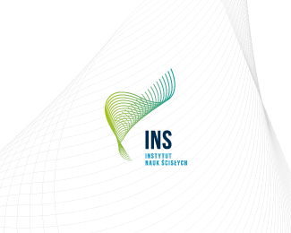
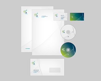
Institute of Science (tutoring in math, physics). The mark relates to hiperboloid (http://en.wikipedia.org/wiki/Hyperboloid)
Status:
Client work
Viewed:
15609
Tags:
graphic design
•
design
•
logotype
•
logo
Share:


Lets Discuss
Elegant mark. The sans-serif type feels a little too stiff for it, but overall it's really nice.
Replythanks Steve
Reply^ Agreed. Seeing it in context gives it a stronger foundation to judge :)
ReplyThank you, gentlemen :)
ReplyI like the mark very much!
ReplyThis is very beutiful..
ReplyThanks guys. I'm glad that you like it.
ReplyPlease login/signup to make a comment, registration is easy