Dozen Flours - chosen design
by atomicvibe • Uploaded: Apr. 24 '12 - Gallerized: Apr. '12

Float
(Floaters:
81 )
Description:
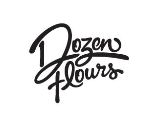
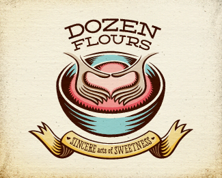
Chosen logo proposal for a baking blog, curated by a passionate baker who loves spoiling people with her delicious treats. Desired tone: Creative, quirky, joyful, homemade, comforting, approachable, feminine, playful, optimistic, and loving. Creative considerations: Client likes asymmetry and clever logos; loves color, but wants logo to reduce easily to black & white; loves swashy, swirly fonts rich with movement. Rationale: Much more than just a logo, this illustrative concept delivers a comprehensive visual language through the collective assemblage of unified, supporting graphic elements. Inspired by the cheerful, wholesome image of a '50s-era American housewife happily baking in the kitchen, this option perfectly aligns with the majority of touchpoints raised in the creative brief. This versatile concept employs a main mark (shown) and several secondary marks that all share the same aesthetic properties. More information & images: http://bit.ly/dribbble-DF-opt03. Full case study: http://bit.ly/av-behance-dozen-flours
As seen on:
Dribbble
Status:
Work in progress
Viewed:
13507
Tags:
typography
•
lettering
•
illustrated
•
illustration
Share:


Lets Discuss
omg !
Reply^Heh, I hope that means you like it...
ReplyI love it!:)
ReplyIt´s amazing, love the illustration:)!
Replyreally love how she turned out. Fun, friendly and such a nice look of the 50's and 60's. sweet.
ReplyThanks guys! I really appreciate all the great feedback, and it's great to see this in the Gallery. Thank you for that!
ReplyDavid, yes, this was the chosen design, but I'm currently negotiating with my client on requested changes to colors and the typeface used on the secondary marks (the character's head & word bubble and the cookie-letters monogram, both shown in the Behance case study).
Yeah, spot on.
Replyshe looks cute. Nice one.
Replygreat character Jon, love what you did on this project!
ReplyOMG
ReplyFloat. Fav. You da man! Stoked to hear she went this version
ReplyThis is fantastic! You have an amazing style.
ReplyThis will make a great logo for my grandma's cookies. Where do you get inspired? Seems very hard to do. I found lately a website called www.creattor.com Someone from here told me about it, I think you should upload your work there. Nice job anyway, congrats!
ReplyJaw dropping work here, as per always. Gotta get a script to automatically float and fav all your work ;D
ReplyWhere do you buy the dotted paper you use in your case study btw? I've been trying to get me some of that but i can't find it anywhere :/
Such perfect logo! nice done.
ReplyWHOA! Boy, I sure am feeling the love on this one. Sam, Julia, Ngodup, Florin, Sabb, Matt, David, Thierry, Marina, Anton, Designer, you guys rule! Thank you so much for taking the time to check this one out. I appreciate all your support.
Reply@Ngodup, I LOVE your avatar, by the way!
@Matt, yep, me too :D She was on the fence between this one and my script version: http://logopond.com/gallery/detail/168594 but seemed to be leaning heavily toward Housewife, here. Glad she chose this direction, as it will definitely make her branding stand out amongst the baking crowd.
@David, I really and truly appreciate that very warm comment. Thank you.
@Marina, if you look at my Behance case study (linked above), you'll see how I get my inspiration. Inspiration comes from everywhere. Yes, I'm inspired by visuals (obviously), but I am also inspired heavily by music, travel, and food. Just taking a walk outside on a beautiful Spring day can fill one with inspiration.
@Anton, really appreciate the sincere comments, man! As for the paper, there are dot grid notebooks out there, and the go-to one seems to be one that's sold through Behance: http://www.creativesoutfitter.com/product/34/dot-grid-book
However, I've heard several complaints about the book, one of which is that the grid doesn't seem to align with any naturally-occurring system of measurement. When I use a dot grid sheet, I want to be able to scan it at 100%, and then place it in Illustrator on top of my grid, and easily be able to recreate my shapes.
So, my solution? Make my own dot grid sheets. Basically, I just created an 8.5" x 11" sheet in Illustrator, set it up with a U.S.-based grid with gridlines at every 1/8", and pasted small gray dots at each 1/8".
From there, I can print as many sheets as I need, or, I can copy and paste the dots into a PSD file, and use it as a background to enhance the "sketchbook" feeling of my sketches - even if I didn't happen to use a dot grid sketchbook when I originally sketched them.
Hope that helps.
This is a seriously nice piece of work. It was a pleasure looking through your case study.
ReplyShe's finally up!!! Came out fantastic!!! I think my favorite part is the amount of depth in the type, the way it looks like it has 'risen' is the oven, especially the D - the faux 3d appearence is an amzing touch.
ReplyDAM! Nice work,...what a case study too, I'm tired just looking.:)
ReplyIan, Josh, Mikey, thanks for your wonderful feedback!
Reply@Josh, totally appreciate your eyes on all this stuff during development.
Love this work!
ReplyMy fave one too, Jon. I hope the blog site design will be supportive too ;-)
Reply@atomicvibe, ty, I actually thought of making it myself since i've been rooting around every damn paper/book shop in all of Sweden with no result! But now I will just make my own! :D
ReplyPlease keep up your work and case studies, they are very inspirational.
Carlos, Inka, Anton, thank you all so much for your feedback!
Reply@Inka, I actually think my client wants me to help her find a web designer who can faithfully carry out my creative vision. So yes, I do believe the blog will be completely supportive. :D
good work
ReplyThanks Sergey!
ReplyThis is gold!
ReplyReally appreciate the kind words, Jovan!
Replyheh this is really nice.
ReplyThanks, abi!
Replysorry buddy...missed this one :) love it of course!
ReplyPlease login/signup to make a comment, registration is easy