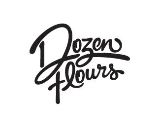
Dozen Flours - option02
by atomicvibe • Uploaded: Apr. 24 '12 - Gallerized: Apr. '12

Float
(Floaters:
71 )
Description:
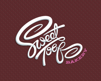
Logo proposal for a baking blog, curated by a passionate baker who loves spoiling people with her delicious treats. Desired tone: Creative, quirky, joyful, homemade, comforting, approachable, feminine, playful, optimistic, and loving. Creative considerations: Client likes asymmetry and clever logos; loves color, but wants logo to reduce easily to black & white; loves swashy, swirly fonts rich with movement. Rationale: Based on the "heart hands" gesture, this option strongly conveys the concept of being handmade from the heart — a fundamental tenet of my client's baking endeavors, and is warm, sincere, and loving. More information & images: http://bit.ly/dribbble-DF-opt02. Full case study: http://bit.ly/av-behance-dozen-flours
As seen on:
Dribbble
Status:
Unused proposal
Viewed:
13828
Tags:
hidden meaning
•
double meaning
•
hand lettering
•
custom type
Share:
Lets Discuss
let me be the first one to say ... how stunning is this ... great work .... awesomeness !!
ReplyAnd let me be the first to say...THANK YOU, Bernd/T&S!!
ReplyGreat work!)
ReplyThank you, Zoya! I appreciate your feedback :)
Reply... amazing ...
ReplyThanks Art!
Replyyeah, i'm very spoiling)
Replyfavorite
ReplyAlena, Szende, thanks for the support!
Replyreally love all three, Jon. Amazing set of designs.
ReplyThanks for the love, Mikey! This was the first to get the boot, though. Oh well, it's all part of the game when you present 3 options. Gotta trim the fat somewhere.
Replygreat great style! lovin it!
ReplyThis is just WOWWWWWWWWWWWWWWWWWWW
Replywow just amazing!!!
Reply@Gary, @Sabb, @Oliver, thank you all so much for your positive vibes! Glad you guys are liking this one.
Replyspoilt client. imagine having to make the decision with these 3 beauties. i'm guessing she resorted to the 'eeny meeny miny mo!' decision making tactic.
Reply@Rebecca, thanks for looking! I appreciate the kind words.
Reply@Matt, Thanks man! Heh, I even told her "good luck," when I sent her the Behance link :D Funny thing is that, while she really liked a lot of aspects about this one, two things struck chords with her, which caused her to eliminate it pretty quickly:
1) Hands touching food. She indicated that this might not have been an issue if she were more of a bread baker, but as a mostly cake/pastry baker, she goes out of her way not to touch food with her bare hands, and is actually skeeved out by the idea.
2) She saw an image of a frog (scroll forming the feet, bowl forming the body, hands forming the front legs), and absolutely could not see past that. Personally, I have wrestled with this, and I just don't see it. But hey, different people see things differently. In my experience, once a client sees something they perceive to be undesirable in a mark, that's all they will ever see, and no matter what you do to try to change their perception, they'll always have that seemingly negative image in their heads. In these cases, it's good that I provide other designs to choose from, so it's an easy way of ditching one of the designs.
Hey, when you provide multiple options, you make the decision to accept the fact that two will be cut. That's part of the game. However, that doesn't mean I can't sill submit unused proposals to awards comps and book publishing consideration :D
understand point 1. point 2 is some serious visual wrestling. i came out a loser. Frog 1, Verg 0. i agree with you entirely about once a client sees something, they never ever move on from it. Good thing you didn't go in with that design as the only option.
Reply^TROOF!
ReplyGood one mate !
ReplyThanks Carlos!!
ReplyInstant like!!!
ReplyHey Jovan, thanks for checking this out!
ReplyThis is my favourite!
ReplyThanks for the love, Rudy!
ReplyI do love this so much :) and congrats :)
ReplyThank you, Hanuman!
ReplyPlease login/signup to make a comment, registration is easy