Dozen Flours - option01
by atomicvibe • Uploaded: Apr. 24 '12 - Gallerized: Mar. '14
Description:
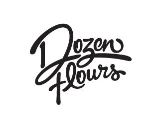
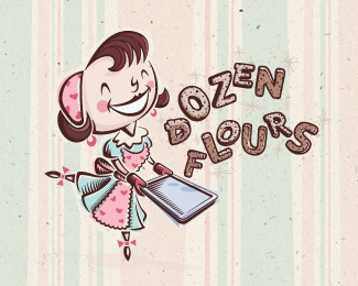
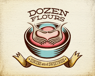
Logo proposal for a baking blog, curated by a passionate baker who loves spoiling people with her delicious treats. Desired tone: Creative, quirky, joyful, homemade, comforting, approachable, feminine, playful, optimistic, and loving. Creative considerations: Client likes asymmetry and clever logos; loves color, but wants logo to reduce easily to black & white; loves swashy, swirly fonts rich with movement. Rationale: While this concept is dynamic and expressive, the real beauty of this design lies in its versatility of application. Stylistically rooted in artisan craftsmanship, it can be painted or written in pencil, pen, Sharpie, or cake piping, or it can be letterpressed, stamped, or silk screened. I would encourage my client to learn how to write the script, so she can actively participate in this identity's propagation in her own hand. Script employs a hidden element. Do you see it? More information & images: http://bit.ly/dribbble-DF-opt01. Full case study: http://bit.ly/av-behance-dozen-flours
As seen on:
Dribbble
Status:
Unused proposal
Viewed:
10698
Tags:
logotype
•
type
•
typography
•
typographic
Share:
Lets Discuss
Thanks for checking this out, Tomas!
ReplyAmazing type
ReplyThank you, Alena!
ReplyType is ranked up there at the top of the set. Nicely done, sir.
ReplyI appreciate it, Mike!
ReplySo do you guys see the hidden element? :D
Lovely
ReplyNice type. I see the 12 ("doze" in portuguese), is this the hidden element?
Reply^DING DING DING!! You got it!
ReplyI start to melt.
ReplyThanks, Jovan!
ReplyPlease login/signup to make a comment, registration is easy