Logo Milk
by designabot • Uploaded: Apr. 17 '12 - Gallerized: Apr. '12
Description:
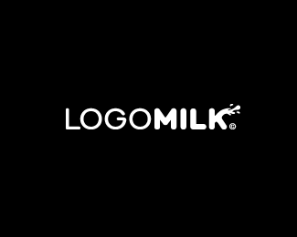
I have been working on a personal project and recently registered the domain name logomilk.com. The idea would be to eventually create 'yet another' logo gallery site. The usp with Logo Milk is that all logos submitted would be in black and white... in-fact the whole site would be monochromatic making it very distinct. I was just playing with the idea of showcasing logos in their purist form before web 2.0 or other effects entered the fray.
I was also thinking about the 'K' being used as the avatar for Logo Milk. The letter K is known as 'black' in CMYK... and after all the site would be featuring monochromatic logos in their purist form.
As seen on:
https://logopond.com/logomilk/bw
Status:
Client work
Viewed:
32,819
Tags:
•
aesthetic
•
mark
•
design
Share:


Lets Discuss
very good!
ReplyCool! Keep us updated about that project! :)
Replyvery nice and sound idea. and i totally dig this logo :D
Replyreally amazing work ... like !
ReplyThat's great fellows, cheers!
Replyreally cool
ReplyThat's a great idea for a site.
ReplyYeah, great idea with the site. I really hope you see it through.
Replylook forward to it, Rich.
ReplyNice idea Rich, best of luck getting it going.
ReplyBrilliant work.
ReplyThanks for the support everyone. Will keep you posted!
ReplyLove the concept. Looking forward to seeing it, I always enjoy seeing logos broken down to their fundamental element. Great learning curve for those who don't sketch or build vectors in mono too. Keep us updated!!
ReplyHa Logomilk, good for the bones. ^ what they said.
ReplyLove the concept Rich! bot of the logo and the site!
Replyi'm super stoked about this idea rich. i really hope you follow through with it.
Reply! coool
ReplyGreat idea, I like the simplicity of it.
ReplyWhat a great idea, Rich. The logo looks very nice. I'm looking forward to this site.
ReplyGreat idea, keep us updated
ReplyCool idea.
Replygreat idea, Rich. pure design at it strongest that's what the site will represent. keep it going.
ReplyI think it will be great site
ReplyNice idea
ReplyGreat wordmark and great idea with the site :). Good luck!
ReplyLovin' this... saw it over on Dribbble. Looked great there... looks terrific on the Pond. Love the idea of the black and white only nature of the logos too. Stripped of all effects and colours will truly show how effective a logo design is.
ReplyThe support for this venture has been overwhelming! David has contacted me and we will be partnering up to drive this forward. With his expertise and a huge audience already in place it was the logical step for logomilk to take. Best wishes everyone and stay tuned...
ReplyWay to go! Love a good concept coming together! And with the Pond's father on board, its gonna be gold!
ReplySo milky ) Love it !
ReplyI love the fact that your doing this. It really comes back to the raw essence of logo design, pure and simple.
Replybad ass.
Replynice logo! can't wait to see the new site!
Replynice one Rich!
Replynice idea!!!!float...
Replyvery cool!
ReplyYeah, B&W only!
ReplyTwo things that I like - logos and milk. You have my support Rich!
ReplyHmmm...spurting white liquid....in the right shape and direction...I dunno 'bout that. It'll certainly make it on the phallic sites.
Reply^That's a bit of a stretch, Glen. A K is the furthest thing from being phallic.
ReplyI think the idea of the site a witty and interesting.
ReplyThis is awesome and very interesting, love the CMYK idea.
ReplyPlease login/signup to make a comment, registration is easy