Tierney
by ColinTierney • Uploaded: Apr. 16 '12 - Gallerized: Apr. '12
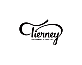
Description:
© 2012 Colin Tierney Design
As seen on:
Colin Tierney Design
Status:
Client work
Viewed:
20697
Tags:
•
tierney
•
colin
Share:


Lets Discuss
some awesome letting, Colin.
ReplyYes, this looks even better vectorized than sketched!
ReplyNice, I like!
Replymikey, filip, levon, thank you guys for the comments.
ReplyLooking good Colin.
ReplyLooks great, my man!
Replymichael good to hear from you man. jon, how about a beer soon?
ReplyClass all the way my man.
ReplyBut are you willing to give up your old one? ; )
Lovely bit of type work Colin.
ReplyPerfect work Colin!
ReplyVery nice letterforms here. Loving the incorporation of the C in the T!
ReplyGreat one!
Replygreat job here Colin, congrats
Replygood letters!
Replylove it
ReplyLooking good, Colin. I love when you can pull part of a logotype and use it as a mark. Having the hidden C in there worked out really well.
Replygreat work man
Replythank you all for the comments. i appreciate each and every one of them.
ReplyGreat letters, Colin!
ReplyI love it!
ReplyYESSSSS! Glad to see this gettin' some gallerizationalistic love!
ReplyCooooooliiiiinnnnn! My man :) !!
ReplyGreat flow, this is awesome Colin!
ReplyNIce one Colin!
Replyonce again, thank you all for the support. it's nice to read these knowing that they come from excellent designers.
Replygreat lettering! nice flow!
Replythank you gary.
ReplyColin you did great job here. Congrats homie!
Replyjovan, i appreciate that man.
ReplyColin, I like it. The question is are you 100% Happy or content with it? That's what matters most. Just curious how you feel about it :)
Replythanks mike. i'd say all in all i'm pretty happy with the end result. i've told others that along with my rebrand, i feel like this could be a new chapter in my design career.
Replytasty flow of letters
Replythank you lady.
ReplyPlease login/signup to make a comment, registration is easy