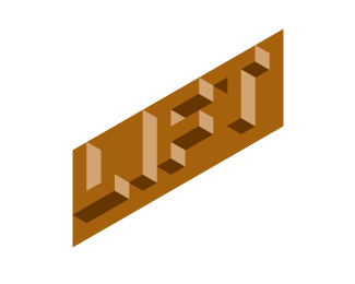
Lift v3
by KGB • Uploaded: Sep. 05 '07

Float
(Floaters:
9 )
Description:
logo for Coffee and Smoothie bar
Status:
Unused proposal
Viewed:
3133
Share:

Lets Discuss
For some reason this logo appeals more to me than version 2, I think it is due to the simplicity of it and the way in which it would be easier to read if walking (past the bar) than version 2- dont get me wrong though, I LOVE v2 as well!
Replythanks. float it and rate it, if you don't mind.
ReplyI like both purple versions (just not the other, blocky one)... this one is just that. very trendy and cool looking. the 'onion' though is different and unique. I like both for completely different reasons. flip a coin!
ReplyNice! What font is this?
Replycustom. I just drew it in Illustrator. thank you.
ReplyNice typography, Brian. I like that f/t ligature.
Replythanks. too bad they didn't use this one.
ReplyPlease login/signup to make a comment, registration is easy