Aaron Burkhart
by adburkhart • Uploaded: Mar. 14 '12

Description:
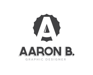
Draft of personal logo I'm playing around with. The idea was to use the natural negative space in the A to mimic a pencil. Feedback appreciated. I'm still unsure what color scheme I want to go with, so grey for now.
Status:
Work in progress
Viewed:
2238
Share:

Lets Discuss
Any comments or suggestions are appreciated. Thank you!
ReplyPlease login/signup to make a comment, registration is easy