Work Horse
by Mikeymike • Uploaded: Mar. 12 '12 - Gallerized: Mar. '12
Description:
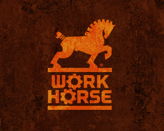
Just toying with this one for now.
Status:
Work in progress
Viewed:
18567
Share:
Lets Discuss
power
ReplyTHX, Hossein. appreciate it!*And thanks for the flats, peeps. :-)
Replyit really does evoke power.*i would like to see the other hind leg, as i think it would enhance the logo even more...maybe in the forward position?
ReplyI hear yeah, Kyle. I toyed with the other back leg and it just seemed to get busier. So I left it as if both hind legs were back and pushing forward together. At least that' what was in my head. :) At that some times is a scary place. HA!. Cheers.
ReplyJust saw your revision with the gear neck, get this thing updated, that is a great revision, man!
ReplyHey Sean, Thanks, bud.*UPDATED!*gave the horse a mane that better matched the cog in the letter %22O's%22 below.*Also cranked up the color and texture of the icon a bit.*Hope you like the improvements.
ReplyYeah, feels %22whole%22 to me now, very nice, Mike. Cool texture too. The neck area is called the %22mane,%22 I'm catching on.
ReplyActually, Sean the hair on the horses neck is called the mane. :D*But your just trying to sucker me in aren't you? HA!
ReplyHa ha! Wow, I'm just looking dumb and dumber. The hair, THE HAIR!
ReplyAs said on dribbble, awesome work! love the head in combination with the typography.
ReplyHA! Sean!*Well then I say thanks to you again, Alex. Appreciate it.
Replyupdate looks great mike. the mark and type are definitely more cohesive.
ReplyYour logo always inspiring!! Let me guess, this is a male horse....hahaha
ReplyAnother great logo Mike.
ReplyThanks, Colin, mean a lot.*Gary, Thanks and YES it is a male. Did someone tell you? :-)*Steve, thanks goes out to you also, sir, cheers.
ReplyNo one, it's mainly because there is a convex on the stomach of the horse which just right infront the leg behind. haha
ReplyOh that's actually a hernia, caused from pulling too hard.**HA!*Thanks, Gary.
Replyso strong and impressive, your work is amazing
Replywell thanks, Lule.
Replyyour a legend Mike, simply awsome work.
ReplyThis turned out nice. I really like the treatment here as well.
Replystrong horse! :) but to me the text is too big - would make it smaller - nevertheless - great!
ReplyTotally disagree with Different Perspective. Text and mark are a good match and will reduce down very nicely.
ReplyCool work Mike! :)
Replygreat one!
ReplyPaul, thanks, bud, too kind.*Jeffery, always nice to get your comments.*Thierry, thx (Lefty) :)*Maciej, appreciate the comment. Feels right, but one always likes to hear other options to make one think before final. THX.*Jacob, glad you like the set up as is. THX.*Ivan, always.....THX!*Damian, appreciate the fact you like the way it is turning out. cheers, man.
ReplyAlso, thanks so much for the gallery spot. cheers all.
Replystrong!
ReplyThank you , Nicolas!!!
ReplyRAD!
ReplyJust Great!
ReplyPhenomenal work Mike!
ReplyRobin and Rien thanks so much for commenting.*Muhammad, nice to hear from you. I really appreciate it.
Replymassive work !!
ReplyTHX, Bernd. you been doing some fine work lately, man. Keep it up!
ReplyThis one is really powerful!
ReplyI think it is perfect now.
ReplyLooks Great Mikey!
Replyah this one is amazing!
ReplyThat's a solid piece of work. Stunning!
ReplyBobby, Jovan, BIG MIKE, Deividas and Ian, thanks so much for the comments. I had a lot of feedback from other designer's to help me get this design to this point, so thanks to many of ya! cheers. And tHX for all the floats. Too kind.
ReplyHey Mikey mike. Is this logo available for purchase?
ReplyPlease login/signup to make a comment, registration is easy