Freenergy
by chrisworks • Uploaded: Feb. 25 '12
Description:
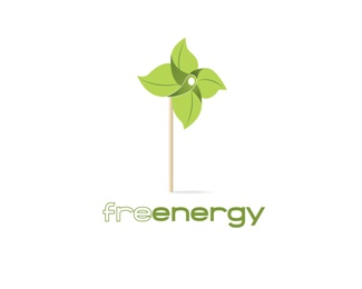
sensitive and intelligent logo for companies related to green energy
this mark has two reading levels:
- weathercock made of leaves
- weathercock as a metaphor of wind turbines
Status:
Unused proposal
Viewed:
6794
Share:


Lets Discuss
this is very good idea but id totally lose the stick and experiment with the font and give it a little more corporate feel :)
ReplyHi t-sovo, thank you for your feedback. In the past I tried without the stick, but I think it gives a certain delicacy to the logo (yes, maybe this doesn't give it a corporate feel and I know it's hard to fit such 'vertical' image in a corporate logo %3B-) ).*Regarding the typeface and the name I used, have to say I'm not completely satisfied, so I think I'll try some different solutions.**
ReplyPlease login/signup to make a comment, registration is easy