Mandy
by VERG • Uploaded: Feb. 23 '12 - Gallerized: Feb. '12
Description:
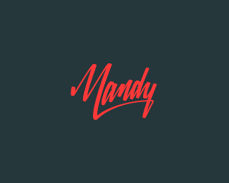
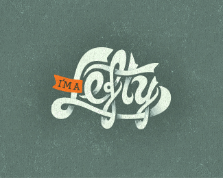
Another signature logo i'm working on for a client.
As seen on:
VERG
Status:
Work in progress
Viewed:
24690
Share:
Lets Discuss
great colorship:)
Replyyesss ... so nice lettering !!
Replyand a great reversed flow
Replythanks for the gallerization LP. champions! and thank you guys for the comments above... really appreciate it!
Replytotally lovin' this typework! :)
ReplyIt's great
Replybeautiful!:)
ReplyGreat type, great colors!
ReplyLove the M-y connection. Colors too. Nice!
Replygreat*
ReplyHandsome typo.
Replysaw somewhere else and love this one too.
ReplyDrop-dead, bang-up, full-on, balls-to-the-wall badassness. I LOVE this. Period. Totally worthy Gallery spot. Mucho congrats to you, Mr. VERG. I KNOW this one will be in the LP v2 book :D
Replythank you ponders... really, absolutely, completely pumped on your feedback and floats. thanking you kindly.
Replygreat
ReplyI keep looking and looking at it... so great! Very nice M-y connection.
ReplyLove that it looks like it was done with a sharpie, and that everything connects at one point or another.
ReplyThank you friends for the kind words. You can now view the presentation by clicking on the behance link above.thanks again.
Replywow. will you teach me in a couple word how to make great signature logo like this? thank you..
Replyhaha! errr... couple of words eh? ummm... i might need a sentence or two: **write until you're happy. once happy and vectored, tweak until your happy - once happy, tweak some more. *
Replyhehehe..thanks vergad, that really helpful. cheerso
Replyha! sorry mate. kind of hard to explain really. I just keep writing and writing until i find the bones of something that i'm looking for. from there i illustrate the outline stroke, angle and thickness. when i'm happy with it, i vector it in illustrator. so much time goes into tweaking the vectors to get the curves bang on. I probably should buy some various stationery and start experimenting with brush pens and chisel tipped pens to cut out the illustration process i've been doing. that would be the more natural approach to getting it right. Sergey Shapiro is the master when it comes to this natural ability to pick up a pen and make type art.
ReplySplendid work!
ReplyThanks Damien... Much appreciated
ReplyFavorite
ReplyCheers Antonio. Stoked you like.
Replyawesome font
Replythank you!
ReplySexy. Confident & Sexy. Double-Sexy.
ReplyI like double-sexy. works for me. cheers champ.
ReplyStunning!
Replythank you rich! appreciate the comment buddy.
ReplyI'm a novice so i was just wondering how do you make
Replythese "handwritten" logos? :)
Uh...never mind...
Replygoood !
Replycheers
Replyvery nice!
ReplyThank you, hanuman!
ReplyGreat one
ReplyThank you John
ReplyMy first baby to reach 100.
ReplyPlease login/signup to make a comment, registration is easy