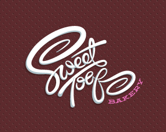
Sweet Toof Bakery - Alt02
by atomicvibe • Uploaded: Feb. 21 '12 - Gallerized: Jul. '13

Float
(Floaters:
54 )
Description:
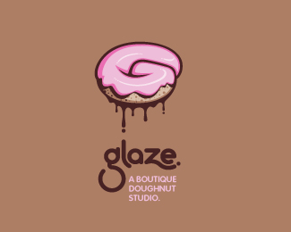
Unused logo proposal for a family-operated, Singaporean bakery specializing in producing handcrafted, artisan baked goods and pastries that use only the freshest ingredients and no preservatives. Client requested an illustrative approach that hit on tonality such as funky, young, modern, playful, hip, and cool, with a slight feminine appeal. This concept delivers a literal exploration of a 'sweet tooth,' and its scripty, hand-lettered type, pastel color scheme, and delicate doily motif give this one a bit more of the feminine edge. Click here to see the entire genesis of this project on Dribbble: http://bit.ly/av-sweet-toof-dribbleproj. Click here to see the Dribbble development of the first sketch through the initial client pitch: http://bit.ly/av-sweet-toof-alt02-sketch. Click here for process shots and more detail of the initial client pitch: http://bit.ly/av-sweet-toof-alt02-process.
As seen on:
dribbble
Status:
Unused proposal
Viewed:
22509
Share:
Lets Discuss
man i would hate to be your client. all three of these are just fan friggin' tastic. this one in particular is my favorite. really you could lay them all out and blind fold your client and let their finger choose randomly because you can't go wrong with any of these choices.
ReplyHeh, thanks man! That's honestly how I felt, too. And that's rare, because I think we can all agree that when we present multiple options, we're all, %22Yeah, I truly believe each one of these would be perfect, blah blah blah,%22 but you know that deep down inside, locked away in a little art box in your heart, is that one super-duper-mega favorite design that you hope and pray your client will pick.
Replylove this!
Replyyou are a master in what you do!
ReplyWow, Claude and Tomas, thanks so much for the kind words!
Replywow amazing work....
ReplyThanks for looking, Oliver. I appreciate the kind words!
ReplyActually, to date, I haven't shown any client any of my preliminary work, but I'm thinking about changing my entire way of presenting to not only incorporate *some* select initial sketches/designs but also more examples of how the designs work in the %22real world.%22 Got real inspired by the way people like Matt Vergotis present, and, with a lot of help and tips from him, I've started working on a new presentation style that has more wow factor. For examples of what I mean, check these links:**http://dribbble.com/shots/443189-Hip-Pups-logo/attachments/27171**http://dribbble.com/shots/436763-Sweet-Toof-Bakery-FINAL/attachments/26396**The idea is that for future projects, I will start including a few sketch frames, too.**Anyway, feel free to email me, and I'll walk you through my entire process.
ReplyI love everything about this logo, from the colours to the font. Beautifully done.
ReplyThat's really nice of you to say, Rahul. Thanks for checking this out!
ReplyWow, great work!
ReplyThanks, Tiago! Wow, what a pleasant surprise.
ReplyWow, very nice!
ReplyGod I dig this sugar coated molar
ReplyThanks Caion and Matt! This is every dentist's dream.
Replylike ^^
ReplyYour logos always have such a great sense of dynamics. Nice work again, Jon. This fits the brief very well.
ReplyI appreciate that, Kevin! Glad you liked this one :)
ReplyPlease login/signup to make a comment, registration is easy