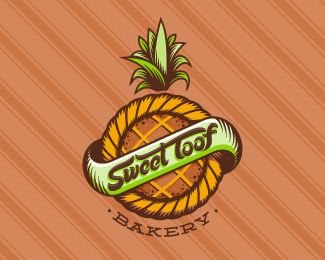
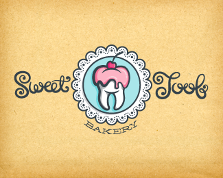
Sweet Toof Bakery - Alt01
by atomicvibe • Uploaded: Feb. 21 '12 - Gallerized: Feb. '12

Float
(Floaters:
76 )
Description:
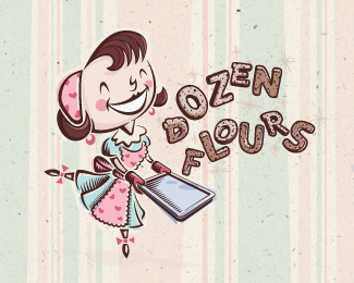
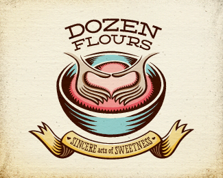
Unused logo proposal for a family-operated, Singaporean bakery specializing in producing handcrafted, artisan baked goods and pastries that use only the freshest ingredients and no preservatives. Client requested an illustrative approach that hit on tonality such as funky, young, modern, playful, hip, and cool, with a slight feminine appeal. This concept features hand-lettered type that looks like it were written in icing. Click here to see the entire genesis of this project on Dribbble: http://bit.ly/av-sweet-toof-dribbleproj. Click here to see the Dribbble development of the first sketch through the initial client pitch: http://bit.ly/av-sweet-toof-alt01-sketches. Click here for process shots and more detail of the initial client pitch: http://bit.ly/av-sweet-toof-alt01-process.
As seen on:
dribbble
Status:
Unused proposal
Viewed:
17718
Tags:
pink
•
brown
•
gray
•
white
Share:
Lets Discuss
SWEEEEET!!! BIG time.
ReplyHi-fives to you, Mikey!
ReplyGood work, Jon)
ReplyThank you, Zoya!
ReplyThis is by far the cream of the crop (IMHO). You've done so much work on these Jon, lets hope your clients end up with a good one.
ReplyReally appreciate the glowing feedback, Norm. But the project's done. Client chose the pineapple tart design. See here: http://logopond.com/gallery/detail/162422
ReplyLOOKS AMAZING!
ReplyCheers, Nick!
Replygreat typework , love this
ReplyPretty cool! the gallery cannot take too long, I think... David is just busy with his book. :D
ReplyThanks, Florin!**@Ray, HA! That's what I'm hoping :D
ReplyExcellent!
ReplyThierry %26 Nazar, thanks for your comments, guys!
ReplyThe curve work on this is just outstanding. I'm guessing a gazillion hours refining those paths?
ReplyYou guessed right, Matt. I think I spent hours on just that S.
ReplyI thought I commented on this beauty!
ReplyWell, now you have! Thanks for putting your fingers to the keys on your keyboard, Rudy :D
ReplyHappy!
Replywaheyyyy!!!! t'was only a matter of time before this sweet little number graced the front page. this truly is a delicious logo. congrats on the gallery spot Jon.
ReplyThere it is! I told you! :D
Replyit's yummy!
ReplyNice one Jon.
ReplyWell, would ya look at that? Thanks LP for the G-spot! And thanks olalb, Matt, Ray, Maciej, and Jeff for all your nice comments :)
Replydeserved gallery piece.
ReplyWonderful!
ReplyWonderful!
ReplyColin, Jovan, Guyon, thank you guys so much for the kind words! Glad you guys are feeling this one.
Replynice font type and effects
ReplyYum-yum %3D)
ReplyExcellent typography, works really well for the intended purposes. Very impressed.
ReplyThis is sweet, man. Well deserved! :)
ReplyThanks for the nice comments, guys! I'm glad you like this one.
ReplyHertz! Long time, man. Thanks for checking this out!
ReplySWEET!!!!
ReplyTOOF!!!!
Replywow !!!looks great
ReplyDude! This is RIDICULOUSLY good.
ReplyThanks for the great comments Daniel and Oliver! Appreciate you taking a look!
ReplyW O W ! ! !
ReplyNice. What's a...sweet tooP? :)
ReplyCome on, man! There's no way that could be mistaken for a P. Could it?
Replyjust great!
ReplyCheers, Hanuman! Thanks for the kind words.
ReplyN I C E =D
ReplyPlease login/signup to make a comment, registration is easy