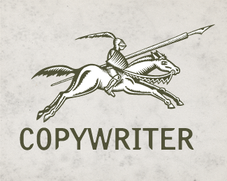
Thanks - You're right about the size thing Mikeymike and in away it almost goes against my own rules. I didn't spend as much time on it as I should and would have regarding proportions e.t.c. When I design a logo, I try among other things to bare mind that a) It must be able to stand as black and white. b) It must be able to be negative and c) It must be able to be reduced to only few millimeters in size. A colorful and Illustrative logo may be a good seller, but problematic in to use in reality. That's why simple minimalistic logos in one color are often the best ones and hardest to design.


Lets Discuss
fantastic
Replyfun piece.*might lose some of that detail as it goes smaller, but like the styel you have going.
ReplyThanks - You're right about the size thing Mikeymike and in away it almost goes against my own rules. I didn't spend as much time on it as I should and would have regarding proportions e.t.c. When I design a logo, I try among other things to bare mind that a) It must be able to stand as black and white. b) It must be able to be negative and c) It must be able to be reduced to only few millimeters in size. A colorful and Illustrative logo may be a good seller, but problematic in to use in reality. That's why simple minimalistic logos in one color are often the best ones and hardest to design.
Replyyou are good
ReplyPlease login/signup to make a comment, registration is easy