Lammtara
by Ameermagdy • Uploaded: Feb. 10 '12 - Gallerized: Feb. '12
Description:
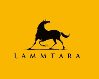
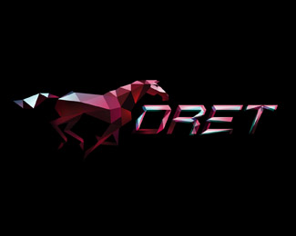
We need to revamp our identity, the title font is not final, still trying to come up with something, any ideas?
As seen on:
Status:
Work in progress
Viewed:
27618
Share:
Lets Discuss
Awsome! The horse is so special, artistic.*I like this type very much.
ReplyThanks Balic! glad you liked it!
ReplyKiller mark man! love it!
ReplyThanks Javaap! :)
Replygreat horse illy!
ReplyHi I want a logo for one of my company. Please let me know how do i proceed I likes your logos . Please contact me on [email protected]
Replyexcellent illustration !
ReplyPretty cool
ReplyNice style on the illustration. Very unique.
ReplyThanks all, glad you liked it!
Replycan't resist may self from digging it... beauty
ReplyThe horse is amazingly bold!
ReplyNice movement and logo:)
Replygreat lines
Replydynamic....dynamite!...love it :) faved!
ReplyDig the top half of the horse. Feels fluid, powerful, elegant. But the bottom half, especially the legs, feels a bit more cartoony and silly. Reminds me of Loony Tunes.
ReplyPlease login/signup to make a comment, registration is easy