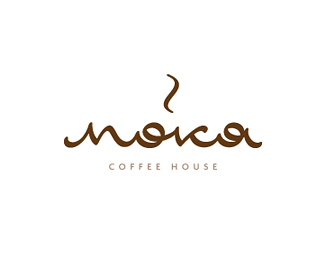
Moka
by master_ino • Uploaded: Feb. 06 '12 - Gallerized: Feb. '12

Description:
coffee house
Status:
Unused proposal
Viewed:
19487
Tags:
pavel saksin
•
paul saksin
•
ino
•
pavel saksin
Share:


Lets Discuss
dont understand the presence of letter 'k'*nice combination of colors though. :)
Reply...but, error in writing
ReplyLooks lovely, but very hard to read.
Replyvery-very beautiful logo, Pavel!
ReplySB, where the error?
ReplyA-IA
ReplyNo rifma vkusnaia, plevat' na oshibku
Replyaaa, ya po tem je soobrajeniyam podzabil na eto)**Thanks guys
ReplyMolodec! Praal'no soobrazil:)
Replyjust amazing)
Replyrukoi uchis' pistat'
Replyreally love the look and feel to this baby. great flow, so smooth.
ReplyThanks!
Replyso steamy and nice
ReplyThanks man
ReplyDig!
ReplyThanks Jovan
ReplyThanks Thierry
ReplyMaster_ino great work man
ReplyPlease login/signup to make a comment, registration is easy