Pase
by kairevicius • Uploaded: Jan. 27 '12
Description:
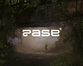
Custom wordmark from scratch.
PHOTOGRAPHY BY GREGORY CREWDSON
Status:
Unused proposal
Viewed:
5007
Share:



Lets Discuss
Type is really cool Paul!
Replyreally cool presentation and unique letterforms, except i read ease before pase.
ReplyThank you guys very much for your thoughts!*@Colin, it is because of unique letter P I think :)
ReplyNeat type, Paul!
ReplyThanks, Nick! :)
Replynice nice %3B))
ReplyKliment, thank you man!
ReplyVery nice type!*I red Rase, Zase, Sase and didn't see P untill I red the name above.
ReplyLuka, thanks! :)
ReplyClassy
ReplyThank you, James!
ReplyThierry, glad to know that! Thanks :)
ReplyRead it pase... no probs with that P.. great work :)
ReplyAciu! Gerai kad nors tau jis aiskus :)
Reply%22P%22 seems legible to me! I kinda don't like this - reversed a - %22e%22. Great work anyway.
Replythe combination between image and type is really match up. congrats!
ReplyThanks you guys! Appreciated :)
ReplyFew elements and repetition *it%B4s a nice combination, very*authentic work, nice type.
Reply@Oscar, thank you for your opinion! :)
ReplyPlease login/signup to make a comment, registration is easy