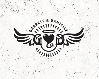
G&D- tattoo
by Mikeymike • Uploaded: Jan. 23 '12 - Gallerized: Jan. '12
Description:
This is a logo/tattoo I am considering. It is fro my two kids, Garrett and Danielle, whom I love no matter what. Good or bad.
Status:
Work in progress
Viewed:
11916
Share:



Lets Discuss
You just keep cranking out stellar work!
ReplyThx, Luma. Really appreciate that comment, means a lot.
Replyoh wow, thanks for the G-spot. (okay so maybe that didn't sound so great, but it feels good. )(:
ReplyMikeymike ... you father ... great man ... excellent designer ... always ipressive to see your stunning work !!
ReplyLove it. But I think a serif font would better suit a tattoo
ReplyThanks for the nice comment, Bernd. Means a lot, sir.*Andrew, still flushing this out a bit, I'll look at a serif face. thanks for the insight. I may not even place there names on the tat, they know who I mean when they see it.. cheers, bud.*And thanks for all the floats, really appreciate it!.
ReplyLove it. I'm designing a tat with my two daughter's names. On this one I think I'd leave off the names and just go with the GD. Then the meaning is even more hidden and just for you. But that's totally just IMO.
ReplyHey Glen. Yeah I am leaving out the names on my tat. they know what i mean with it and so do I.*Love to see what you come up with for your daughters.*Cheers, bud. take care.
Replyhey mike! lovin this as always with your work. A few questions/comments:**I instantly read it as GOD. Is this done on purpose? If so, then awesome! If not, then I'd see if i could make that heart look more ampersandish, or make either the heart or the initials less prominent. **Also, there's some pretty thin hairline strokes going on in the heart. Not a huge deal, but they can get messy with tattoos. **awesome work!
ReplyHey mike, wonderful tat! *IMO, If you are going to omit the names, I think you could simplify it further by taking out the circle of arrows. Nathantrafford has a valid point. Ink is a commitment and the mark will hold its own!
ReplyHey Nathan, thanks for the comment. I actually don't mind at all that the word %22GOD%22 stick out to some. Fitting in my book, anyway.*Ashley, agree with you and Nathan, I do have to make it a tad simpler for the real tat. Don't have any body art yet, so I want to make sure this is simple, but with a statement. They don't come off easy. :D**Cheers.
ReplyPlease login/signup to make a comment, registration is easy