Benchmark
by VERG • Uploaded: Jan. 16 '12 - Gallerized: Jan. '12
Description:
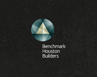
Benchmarks are the surveying starting point for construction sites. With the mark I have come up with a symbol that draws reference to both the traditional cut in stone benchmarks and the modern day bronze discs that have a triangle as the centre point.
To see the full presentation, be sure to check out the behance link
As seen on:
VERG
Status:
Work in progress
Viewed:
25635
Share:
Lets Discuss
Very nice presentation in Behance!
Replyagree, logo looks amazing:)
ReplyHoly sh**!
Replyvery subtly and effectively. Nice!
Replyvery very cool
ReplyImpressive!
ReplyAs I said over at the other place, awesome stuff, Matt!
ReplyBrilliant, love the concept!!!
ReplyAcquainted with the presentation on the Behance, great! Liked the efficiency and simplicity of operation of the brand.
ReplyKeep us informed on how the presentation went. Make sure you have a couple of ambulances and paramedics on standby %3B) Great job my friend.
Replysuper style!
Replyone of the best logos I have seen in a long long time, as they say stateside AWSOME!
ReplyAmazing indeed! :)
Replyincredible presentation
Replywow! super pumped... thank you logopond for the gallery inclusion!! I'm going to collectively thank you all for some truly well received feedback. it's always great satisfaction to hear it from other fantastic designers. you're legends the lot of you! thanks a million.
ReplyGood effects!
Replypushes the limits, i love it -- and presentation is key sometimes
ReplyCool creation
Replyawesome presentation and logo. simply beautiful. thumbs up big time.
ReplySimply stunning presentation:)
Replybreath taking logo. good work
ReplyThanks again everyone for the amazing comments. Cheers a million!
Reply*O riginal*M asterpiece*G reat logo!***The sequence of the process to*achieve this beauty it%B4s awesome*Congrats Vergad!
ReplyBig up the VERG massive! Loved this on Dribbble, homie. Love it here, too.
Replyimpressive!
ReplyCheers friends. Again, overwhelmed by the appreciation this has received. big thanks.
Replyvery nice, love it!
Replywow...you have such a good sense of this knid of color dude, love it :)*
ReplyPlease login/signup to make a comment, registration is easy