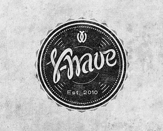
Y-Wave
by Kruglov • Uploaded: Jan. 15 '12
Description:
Sound recording & equipment
Status:
Client work
Viewed:
13112
Share:


Lets Discuss
Feel free to comment, this is the final version
Replyproblem reads - Y-nave
ReplyDo you have a cool sign at the top - YW, why not develop?
ReplyIf readability if the main size %26 style will be insufficient, ovesection shadows is optional. Hires: http://www.behance.net/gallery/Y-Wave/2891603 For the sign - client does not accept any laconic sign.
ReplySmall laconic sign in this version brings good emotion %26 value to the whole logo imho
ReplyVery cool, but from the thumbnail I read Shave.
ReplyThe type it%B4s very unique, I like it a lot,*plus I think the union between the %22w%22 %26 %22a%22*looks good. **The only thing I%B4d change are the details *around the circle, looks like a bottle cap, *I don%B4t if that was the intention. The *whole idea looks like a vinyl record I%B4d make *more lines like the one on the center, *that way the emblem would look more like *vinyl.**Congratulations great Design Kruglov! *Floated and Faved**
ReplyThank you, i agree about triangles around the circle.*The idea of main form is not vinyl disk, a little bit like vinyl, a little bit like speaker and concentric arcs shows the idea of sound, sound wave.
ReplyVery nice!*I only think %22w%22 is a bit hard to read.
ReplyAgree with the idea of *main form, and maybe this*image could help you with*the outside triangles: *http://goo.gl/VIucP *
Replypretty cool piece !!
ReplySuper dig this. It's very 'cool'. Legibility issues with the 'Y' and the 'w'... I would probably tighten up/reduce the lower curl of the 'Y' and pull back the self-cast shadows on the 'w'. Despite those thoughts, it's quite wicked.
ReplyPlease login/signup to make a comment, registration is easy