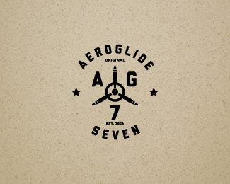
AG7
by ColinTierney • Uploaded: Jan. 12 '12 - Gallerized: Jan. '12
Description:
© Colin Tierney Design
As seen on:
Colin Tierney Design
Status:
Client work
Viewed:
8789
Share:




Lets Discuss
one last stab at this. let me know your thoughts/suggestions. i think i'm leaning more towards this one.
ReplyNice, Colin. Looks great over that background too. I like the little bit extra tracking applied too. %3B)
Replyreally nice lookin' Colin.
Replygood stuff colin
Replysean, mike and dan...thanks guys.
ReplyBetter, nice one
Replythanks, paul.
ReplyLeaps and bounds better.
Replythank you ryan.
ReplyClassy stuff. I like this a lot.
Replyhey thanks jan.
Replysolid, very nice!
Replythanks, and to the floaters as well.
ReplySweet
ReplyI thought you were finished with this project. Regardless, this looks great, man. Nice balance. Congrats on the gallery spot!
Replythanks for the g spot! jon, i wanted to revisit that AG7 seal i posted awhile back because i wasn't happy with that one. so this is the spawn of the earlier version. they chose to use all three variations and we might be using this one in the near future for t shirts. thanks for your words!
ReplyDeserved g.spot Colin!
Replythanks jovan.
ReplyWow can\'t believe I missed this one! Very well done Colin.
Replythanks for the comment, nash.
ReplyPlease login/signup to make a comment, registration is easy