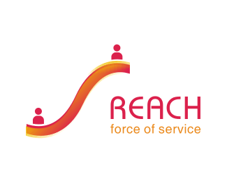
reach_elevate
by rambal • Uploaded: Aug. 16 '07 - Gallerized: Apr. '08

Float
(Floaters:
10 )
Description:
organisation for rural people development. Concept behind is Elevate their life.
As seen on:
http://www.thereach.co.in
Status:
Nothing set
Viewed:
5863
Share:
Lets Discuss
Thanks.%0D*I'll work on the colors.%0D*
ReplyMuch better
ReplyNicely brought to life, rambal.
ReplyWow, this has come a long way. So much better!!
ReplyWoooowww,very nice!
Replythank you dache, firebrand, ocularink, andersonmarques.%0D*i grow with your valuable comments
ReplyI like this one and don't mind the colors. But I'd try it with the people separated (in the yellow) w/out the gradient.
ReplyAh, rfrusso gave me an idea. What if you lose the gradient, and split the 's' shape (for lack of better words) down the center so the top half of it could be the yellow (which would merge with the people shapes, and the bottom half could be the other color. Might be interesting. Does that all make sense?
ReplyI'm implementing rfrusso's suggestion. It comeout well. %0D*Kindly check that.
ReplyDear Ocularink, I'm trying to incorporaae your idea of splitting into two pieces and fill with 2 different colors. Is not coming well. Kindly check the new one
ReplyI like the finished look. Nice work, Ram.
ReplyI'd try removing the human figure on the left.
ReplyPlease login/signup to make a comment, registration is easy