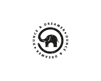
Dunce & Dreamer
by JamesEwinDesigns • Uploaded: Jan. 04 '12 - Gallerized: Jan. '12
Description:
Concept for an up-and-coming clothing company.
Status:
Unused proposal
Viewed:
15605
Share:



Lets Discuss
fun little piece here. like it!
ReplyThis is really cool.
ReplyThanks for the comments guys.
Replygoood one
ReplyCheers pc!
Replyhaha:)*really fun one:)
ReplyGreat stamp!
ReplyThanks for the feedback
ReplyThis logo looks really great, but I do not like that grunge on it :%5C
ReplyVery similar concept*http://logopond.com/gallery/detail/151232
ReplyI’ve never seen that before applex. I feel that they’re safely different. Any thoughts guys?
Replybloddy cool!
ReplyThey are different besides the trompet going around. Nice Symbol! :)
ReplyThanks Robiro, I’m always conscious of creating my own concepts so it is a shock when you learn something may have been done in a similar way, but I guess it just comes with the profession. I am confident that mine stands alone though. Nice one for commenting buddy. Thanks.
ReplyI think they both have the same underlining concept although this version looks aesthetically better.
Replybeauty
ReplyThanks guys
ReplyPlease login/signup to make a comment, registration is easy