Tokyo Bicycles
by growcase • Uploaded: Nov. 28 '11 - Gallerized: Nov. '11

Float
(Floaters:
68 )
Description:
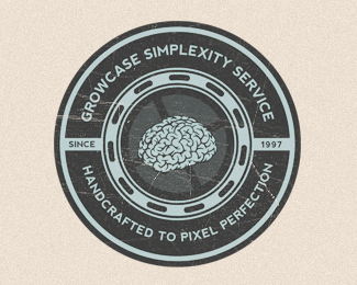
Logo for Tokyo Bicycles with complementary mark.
First thought was to go the obvious route and use the O's in Tokyo as wheels and bend the type into a bike, but it felt too obvious and forced. So went the classy way instead ;)
Been a long time since I worked on a emblem styled logo.
Was heaps of fun.
All types of honest and dishonest feedback highly appreciated as always.
Also, big thanks to Riley Cran for type tweaking pointers.
Originally posted on Dribbble: http://drbl.in/ctpN
Status:
Unused proposal
Viewed:
29594
Share:


Lets Discuss
really liking this one. nice.
Replymmm good -)
Replynice, Emir.
ReplyThere might be too many things going on, but maybe it's just me.
ReplyAgree with milou, a bit too much going on. Tokyo bicycles really needs to stand out more. That said I really love the colour choice, typeface used and very clever use of a bicyle chain. Thumbs up :D
ReplyI agree that there is a lot going on but I disagree that this is an issue. It harkens back to a classic time when all logos seemed to have a multitude of elements. The one thing I would like to see is the lines of the script cleaned up. Overall it looks good, but some areas look a bit rushed. Great work!
Reply%5E i agree. especially if this is for a mom and pop shop.
Replyhi Emir... you know ... I like this logo very much ... good to see you here ... !!
ReplyAlso wanted to mention how much I love the smaller supporting TB icon. I assume it would be used when the size of the logo would just be too small to be legible with the full logo, correct?
ReplyWow, thanks for all the comments and feedback guys. Highly appreciated!**I have to remember to check back in on Logopond more often, heh.**And yes, Notjelly, that's exactly the intent of the complementary mark :)
ReplyTriple Kill, excellent stuff man
ReplyI read the above comments stating there might be a tad much going on. I don't think the number of elements is the problem. It's more about hierarchy and scale. All of the elements have about the same visual weight so the eye doesn't want to rest. It just bounces around. Great design and color.
Reply@yhanktou - Cheers man, thanks.**@logoboom - Thank you. I agree completely after reviewing comments from Dribbble and various feedback I've received elsewhere this seems to be the one major flaw about it. I simply changed the bow text at the top to the darker color and that worked wonders. Put the centered ring with %22Tokyo Bicycles%22 right into the prime focus. So that's probably how it'll end up.
ReplyAwesome! I love the colors and the Tokyo type that you made. I would actually make the chain thicker and make the rings/border less bold so you could enlarge the main type in the middle. Sorry for having so much to say, but I really like your logo.
Replythis is awesome! great gallery...
ReplyPlease login/signup to make a comment, registration is easy