Personal Logo V.1
by Heath • Uploaded: Nov. 27 '11 - Gallerized: Nov. '11
Description:
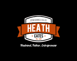
I am starting a website and decided to make a logo for myself. I will hopefully put it on some print promotions soon once I get more content on the site so I want it polished. I am trying to reach out to my clients in a more personal way through the site.
As seen on:
heathcat.es
Status:
Client work
Viewed:
7559
Share:


Lets Discuss
nice personal one ...
ReplyI may have selected the wrong option, because it says %22Not seeking critique%22 but I would love comments AND critique. Thanks to those that have already commented and liked this one.
Replyso you are seriously looking for critiques ... %3BD ... ok ... I would optimize the kerning of HE A TH ... and what is your name ... HEATH, HEATH CATES, HEATH CAT, or HEATH CAT.es ?? ... all identical font except the Lobster ??? I think the readability of the Lobster isn't that good .... but that's only my opinion ... %3BD
ReplyThanks CD, I changed it. **Also, I have done a few changes but am going to refine it a bit more before I post a v3 since I posted a v2 and have some feedback from it to consider as well. **As far as my name, I think it is obvious in the design (Heath Cates) but I agree heathcat.es is not the %231 choice. I owned heathcates.com a long time ago and the reg went out of business and I lost it. I haven't been able to get it back since. I have used heathcates.info, cateshome.com and heath.fm but I do like heathcat.es better than anything I've had since the .com. **Thank you all and keep the feedback coming!
ReplyI like. A few things:**1. Is the top arch of the ribbon a different degree of curve from the bottom curve? It looks like it. It should be the same if it isn't.*2. I personally avoid using religious references such as Bible verses. Not because I am against them (I am Presbyterian), but because you may cut out a segment of your market out that may or may not appreciate it. Most clients really don't care much about your religious affiliation, they care about how good your product or business is and how that affects their bottom line.*3. If you keep the verse, make the top curve of the white %22badge%22 portion to be less severe. Not so round as to match the arch of the verse so they aren't so different.*4. Yep%3B learn kerning. The E-to-A and A-to-T need proper spacing.*5. Black, orange and white? If you're going for %22more personal%22 then think about other color combinations that aren't so masculine or construction company-ish.**My 2 cents.
ReplyThanks for the comments. I am thankfully very busy with some other work at the moment. Plan on taking this all in and working on it soon.
ReplyPlease login/signup to make a comment, registration is easy