Luka Balic
by balic • Uploaded: Nov. 16 '11
Description:
My personal logo.
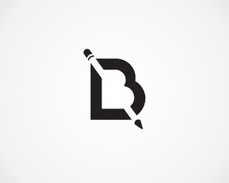
Logo is made of my initials LB and a pencil in negative space which symbolizes designing, drawing, illustrating.
In previous versions of my personal logo, I was focused on implementing a feather in it. I noticed that on smaller sizes feather is not easily recognized, so I tried to forget all previous versions and ideas and start over.
Please check out older versions and let me know which one is overall winner.
Your comments are wellcome!
Thanks!
As seen on:
My portfolio
Status:
Work in progress
Viewed:
17134
Tags:
LB
Share:
Lets Discuss
looking at it ... I realized ... this must be you ... there are so many pencil solutions ... I like the feather a lot more ... %3BD
ReplyWinner! Although you could simplify the eraser end even more.
Reply@Type%26Signs - I agree there's something special about feather, but there are also some special problems with it.Thanks for comment, I really appreciate it!**@lumavine: Thanks man! I made first simplified ereaser end, without that line below, but it didn't look logical. I expect to see the metal holder of eraeser at the top, so this one looks better to me.**Big thanks to all swimmers!*Please leave comments on which version you think is the best one and why.*Thank you!
ReplyLooks pretty cool. I also think the B by itself is nice
ReplyI mean the L and B
Reply@cerise - Thank you! Only LB was actualy first idea, then the pencil just happened ... sort of happy accident :)
ReplyThe hardest thing is to create own logo, but u DID IT! congrts!
ReplyNice solution
ReplyThank you guys! I really am my own hardest client, always asking for more, revisions of revisions... and I never pay myself :D*Tomasz, I wish you a nice journey with your own logo!
ReplyThe idea is brilliant!
ReplyThank you Lukas! I really appreciate it comming from you, since I'm sure you also stared at LB letters for a long time :)
Replygreat personal logo ... like it !!
ReplyI like it very much. It's what got me here, to view your showcase.
Replytop work
Replypersonal work is always the hardest, yours is quite nice. im still trying to figure out my personal logo
ReplyNice personal mark you've got going
Replywww.lyricbinge.com
ReplyMislim da je ukraden...
Very nice!
ReplyPlease login/signup to make a comment, registration is easy