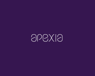
Apexia v1
by tabithakristen • Uploaded: Nov. 14 '11 - Gallerized: Mar. '13
Description:
Working with custom type. v1
Status:
Work in progress
Viewed:
5373
Share:




Lets Discuss
Thanks for the floats, I appreciate it. Any feedback is also appreciated :)
ReplyHi, Tabitha. I like this typography a lot. I wonder how it would look if you remove the rounded corner at the top left part of the %22a%22. I hopoe you get my idea, sory for my english. ALso the same thing for the %22e%22. Is there a purpose you haven't made the %22p%22 just like the %22e%22 but instead of this is different. With the suggestions i thing X won't fit anymore and would be better to keep only one of its ends curly and the rest straight lines. These area just a suggestion, maybe because it looks to me too feminine right now but it's a great type. Best.
ReplyLike.
ReplyThanks Flit :)*ghost_d7: Thanks for the suggestions :)
ReplyModern!
ReplyThank you pjmaster :)
Replyit always scares me to add lowercase between uppercase but this looks good to me!
ReplyThanks cream5! And thank you to whoever gallerized me again :D
ReplyPlease login/signup to make a comment, registration is easy