Rockslide
by malicho • Uploaded: Nov. 09 '11 - Gallerized: Mar. '12
Description:
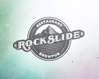
Updating current logo seen on above address. Conservative approach to a logo update.
As seen on:
The Rockslide
Status:
Work in progress
Viewed:
12862
Share:




Lets Discuss
Nice. I personally don't think you need the little knobs on either side of your %22ROCKSLIDE%22 type though. They don't really add anything to the logo.
ReplyThanks sdijock. I've been on and off with those and you're right, they serve no purpose.
ReplyVery nice! Agree, don't need the knobs.
ReplyReally awesome!
ReplyLove this! Great work...
Replywow wow wow!
Replyawesomeness :D
Replylove the feel of that mark! one of my favs! good job! :)
Replywow !
ReplyThis is amazing :)
Replythis is nice!*
Replywow, thanks a lot everyone, didnt expect such a response!
ReplyVery good!
ReplyVery good. I agree with sdijock about the knobs and also think the %22E%22 at the end of the name was strange. I see Rock Slid E.
ReplyPlease login/signup to make a comment, registration is easy