Clarke & Cunningham.
by ArtMachine • Uploaded: Aug. 06 '07 - Gallerized: Aug. '07
Description:
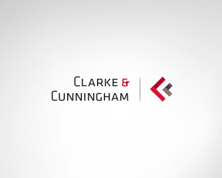
Logo concept for Clarke & Cunningham, solicitors and attorneys.
The logo ought to be traditional but with a modern twist.
The symbol incorporates 2 C's referring to the
initials of Clarke & Cunningham (initials as a traditional element)
Furthermore it represents care, service and safety by resembling
one instance (C&C as the big, red 'C') standing behind another ( the client as (the smaller 'C')
Status:
Nothing set
Viewed:
17977
Share:

Lets Discuss
I don't think you need the different shades in the Cs. I think it would work better as solids.
ReplyHmm, also thought about that but then considered the shading a %22modern twist%22 **: )**
ReplyI see, but they're attorneys. How modern can they be?
ReplyCorrect. But I thought the whole logo, typeface, alignment etc. looks traditional and maybe that could beef it up a little.
ReplyNice one Art... I think if you square up the shapes it will be perfect.
ReplyI like this layout better. :)
Replyyeah, this one is way better!
ReplyLooks good!
Replygreat logo, i'm wondering what font do you used on it.
ReplySometimes, it's best not to explain too much and leave it to the general public. In this case I see the Big C (attorney) consuming the little client ( Greater sign). I would have never thought that way until I read your explanation.
ReplyI understand what you're saying, but in this case the comment seems to be appropriate since you for example interpret something else than originally intended.
ReplyAnd shiimerea: Thank you, it's Klavika.
ReplyI love the shading. Makes it look like folded paper. i.e. the Deconstruct logo by 38one. This is a good modern twist on a played out chevron. I love the logo
ReplyExcellent modern way for a so traditional business! I love it!
ReplyThank you very much pnautilus and thomas! **: )**
ReplyNice %26 simple, but effective.
ReplyThanks Vladimir
ReplySelected for the %22Shapes %26 Symbols%22 edition of the LogoLounge Master Library series.
ReplyPlease login/signup to make a comment, registration is easy