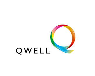
Qwell
by brandberry • Uploaded: Aug. 06 '07 - Gallerized: Aug. '07
Description:
Marketing company
As seen on:
Status:
Nothing set
Viewed:
38396
Share:





Lets Discuss
nice
Replyvery nice, but the tail of the Q looks forced or stuck-on. I know you're matching the typeface, but I think it could flow off of there better.
ReplyI agree with KGB. *You could leave out highlight on the blue part which still belongs to the %22O%22 and then highlight the upper part of the tail instead of the lower. Just a thought, wanna help to make it perfect. : )
Replythis is nice. But I have to agree with KGB
Replymuch liked
ReplyI would make the lower tail and curve of the Q one piece. This way you loose the transparent line that is there now.
Replythanx guys ill try to make it better
ReplyIt's a lovely logo... but the resemblance to the %22Qwest Communications%22:http://www.qwest.com/ logo is too close for comfort.**
ReplyThis is really cool...it reminds me of a lifesaver candy. Very nice work
Replyi agree with silusgrok... that's the first thing I thought of when I saw this. I think it is mostly because you are using the same font as they are.
ReplyI think it looks more like %22Uniqa Insurance%22:http://www.wsz.at/cms/upload/sponsoren/uniqa.jpg
ReplyI like it the only problem I have is the logotype and the symbol or the colorful %22Q%22 is to far apart, and seem seperate. They don't feel like they belong together, but two seperate entities.
ReplyIt's not just the same font... but using the same font when both companies names start with %22Q%22, and then using a nearly-identical concept for the glyph.
Reply2 silusgrok *i live in Russia and i dont know this companies especially those logotypes. Ideas are different.
ReplyI don't think your logo resembles the others at all. The tail could to with a little refinement though. Nice, bright and colourful like the rest of your showcase.
Reply%22i live in Russia and i dont know this companies%22**You're using the EXACT same typeface, dude. Not buying it. Not that I care that you rip off Qwest. They are evil! %3Bo)
ReplyI like the logo, but it looks way to much like Qwest for me.
ReplyAgreed, when I saw this on the front page I immediately thought Qwest. The company is sure to get a C%26D if it does any business in the western hemisphere.
ReplyLove it.
Replyhey..that's really cool logo..how blend those??
ReplyQwest is a large communications company in the USA and everyone familiar with Qwest who sees this logo immediately thinks of Qwest. http://www.qwest.com/**The first 3 letters are the SAME (QWE)*Both have 5 letters*Both are in the SAME FONT*Both have the SAME kerning*Both are (black)*Both have a 'Q' icon in SAME positioning (upper right corner of text)*Both use a light blue in the Q icon**This happens all the time. In the world of design it's getting difficult to be unique. I'm sure you didn't know. but now you do. You can do something way better and different than Qwest's ugly duQling.
ReplyYeah, I knew this looked extremely familiar.
ReplyNice %22Q%22!
ReplyI meet this logo around all the time. 4 years old and still hot looking! :)
ReplyPlease login/signup to make a comment, registration is easy