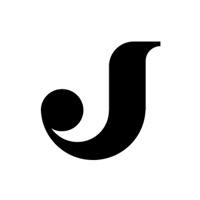
FlyFinland
by JuliusSeniunas • Uploaded: Oct. 08 '11 - Gallerized: Oct. '11

Float
(Floaters:
126 )
Description:
Fly to Finland . Finland flag was used to form the plane shape .
Finland flag : http://www.worldatlas.com/webimage/flags/countrys/europe/finland.htm
Status:
Work in progress
Viewed:
11328
Share:

Lets Discuss
Look at this one , and then look at Finland's flag :) !
ReplyNice concept..
Replyman ... you are machine ... !
Replywell , thats my free time :D
ReplyJust wondering , what about the small tail at the end of the imaginable plain ?
ReplySmart!
ReplySimple, clever. Good job!
Replyyeah clever idea.
Replythank you very much ! %3B%5D
ReplyReally clever and well-executed. Nice one man.
ReplyGreat work, really like it! Student work as it is, it could easily compete with Finnair's brand image :)
ReplyWonderful Concept
Replythanks !!! haha , should i offer them my concept ? :DD
ReplyGreat concept and execution. Shouldn't the colors be reversed, though?
Replyammm , no , i think that these works good , i added link in description :) **Flag - http://www.worldatlas.com/webimage/flags/countrys/europe/finland.htm
ReplyThank you all for the floats !!! :%5D Really nice to feel support from you guys :) !
ReplyFantastic concept/execution. Really nice!
Replywuolia , this has got more floats than swiss dance and ekocare !!! :) thank you !
ReplyThe branding potential for this is through the roof!!!
Reply%5Eagree, nice observation Mr. Jands
ReplyTHANKS !!! *yeah , thought about making : flySwiss ... and etc :) !
ReplyCongratz Julius!
ReplyOn the money champ:)
Replycool :)
ReplyCleverly done. Nice idea, mate!
Replythanks a bunch :) !!
ReplySimple and clever!!!
ReplyAs i said before, Julius, well done. There is no need to add extra details. It is clear, simple and clever :) keep goin.
ReplyGlad it made gallery. It still surprises me:)
ReplyWow man, great and clever! Congrats.
ReplyYeah! Nice!*Mannerheim Hi:)
ReplyGreat simple
ReplyVery good idea.
Replythank you people ! :%5D
Replycute!*
ReplyClever indeed. Nice vision.
Replylove it. I only wish it were truer to the actual flag/stripe proportions
ReplyAgree with Glen, but very clever indeed!
Replyclever!
Replythanks ! *Logoboom , i thought about that , going to experiment a bit , and in case of success i am going to upload it :) !
ReplySo clever! Cool!
Replyclear and simple
ReplyNice! Im from Finland myself %3D)
Replythank you ! **Haha , greetings from Lithuania !
ReplyLithuania rocks! Smart concept.
Replywords of wisdom!
ReplyPJMASTER , man , you are RIGHT !
Reply25%25 Lithuanian!
ReplyGreat concept and I love that you kept the design minimal and simplistic as the concept is strong enough. Excellent logo Jands.
Replythx ! :%5D
Replyi want to fly to finland :).
ReplyKiller concept man!
ReplySimple and effective
Replythank you !!!
ReplyWoW!! i Like it!
Replycall me the black sheep - but I'm going to say this stuff is better suited for something like this..**http://www.youtube.com/watch?v%3DJ59n8FsoRLE
ReplyThanks for posting, Raja:)
ReplyNikit, a ty zdes' kakim kakom?:)
ReplySorry Nikita, Thanx Raja:)
Replyhmmm ,Raja - cant get your point :) ?
Replyawesome mark, im not sure helvetica evokes feelings of a fun time though.
Replythank you malicho :) Actually , since the mark is simple , i needed the type that is simple too and does not overcome the mark :) .
Reply%5E You're thinking is dead on perfect and correct, good choice.
Replythanks Sean :)
Replyhttp://www.mp3car.com/attachments/worklogs/14641d1116983627-1994-oldsmobile-cutlass-supreme-sl-not-done-yet-but-close-1a.jpg
Reply%5E Clearly unintentional, but I thought that symbol seemed familiar. But I'm old and remember that old logo.
Replyyes i know, but the symbol is too much similar, im talking like %22a client%22, they never want to be %22similar to%22
Replyanyway this is a great logo :).
Replythank you :) !
ReplyStunning!
Replynailed it
Replythx %3B%5D
ReplyAs your concept really works on this one I hate to break this to you:**http://en.wikipedia.org/wiki/British_Rail**British Rail have had this logo for some years and it is quite famous, and I think the similarity is too strong, sorry...
ReplyNice idea.. Concept is fine but need some work with plane shape..
ReplyIt's clever, to be sure. But how would you handle it without being reversed out of blue, which is essential for the whole flag concept to work. It needs to work as a positive and reversed and b%26w, as well.
Replythank you for all your comments %3B)**Stoshio - it is a concept and it obviously doesnt work well in black and white , or reversed colors :).**however , if this one would be realised , i think that we would be able to find solution fo this problem :) .
Replyi like the concept
Replythanks %3B%5D
ReplyNice concept, great logo.
Replythank you man :) !
ReplyJust brilliant! :o
Replyseveeeeeeen :D
Replybro, i dont try , i cant do anything about this :D !
Replybesides floats are overrated. Value the comments. what is 100 200 300 votes gonna do for you anyhow?
Replylogomotive - you are right :) Just thought about it , thanks for ... advice, thats how i could say :)
Reply:) it's a MUCH different story on Dribbble however. It puts you on the Front page.
ReplyPopularity first and foremost puts you on the front page of dribbble. The current top five have between 2k and 5k followers.
ReplyYeah, but 90%25 of comments are praises. Kudos here, kudos there...
Replyman ...hope you get soon your hundredth float .... and than ... back to business ... I hope you will get much more for your children to tell about all you achieved ... %3BD
ReplyThere you go jands float %2395 :) cool concept!
ReplyBrilliant brilliant idea :)
Replythank you :%5D
Reply100 floats is coming!
ReplyThere you go 100 floats.
ReplyWhat the hell...How did I not float this. Well there you go..101!
ReplyRocks!:)
ReplyHyv��.
ReplyHyvaa.
ReplyPlease login/signup to make a comment, registration is easy