Jabberworx
by richardbaird • Uploaded: Oct. 03 '11 - Gallerized: Apr. '12

Float
(Floaters:
44 )
Description:
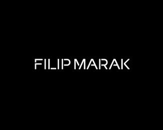
Jabberworx is an independent Australian game development company who recently commissioned me to develop a new identity that would visually characterise the high quality nature of their games, their professional approach and playful sensibilities. The solution I delivered is based around the theme of ‘works’ (industry) and community from which I created a bespoke logo-type, three individual logo-marks and a pattern. Each of these elements can be combined to represent the wider ambitions of the company and the global community of gamers.
The letter-forms of the logo-type were developed from scratch and utilise stencil cuts and wide geometric forms to consolidate both technological and industrial aesthetics. The ‘ab’ pairing was adjusted to form a subtle infinity loop to represent endless gaming possibilities and adds another layer of depth to a simple typographical direction.
As seen on:
See the process behind the identity.
Status:
Client work
Viewed:
4998
Tags:
word-mark
•
custom
•
development
•
playful
Share:


Lets Discuss
awesome project Richard, stationary looks so nice..:)
ReplyThanks Deividas glad you like it!
ReplyTop notch work Richard!
ReplyGreat type, Richard!
ReplyReally enjoyed the write-up on BP&O Richard, the stationery set you developed has got a solid, well-established feel to it.
ReplyThanks Josh.
Replyvery nice balance and flow.
Replygreat logotype, love the stationery, awesome stuff Richard
ReplySolid branding.
ReplyPlease login/signup to make a comment, registration is easy