Martin Vollinger V.2.
by balic • Uploaded: Oct. 02 '11 - Gallerized: Oct. '11

Float
(Floaters:
51 )
Description:
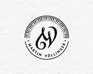
Logo design for composer and music pedagog.
The "g" letter is made to look like violin key.
The client wanted happy and joyful look but still to represent proffesional musician.
This version has two curles more (on "t" and on "V" ).
Let me know what you think, thanks!
Status:
Work in progress
Viewed:
8401
Share:


Lets Discuss
I made the curl on %22t%22 to fill up nicely the space in word %22Martin%22, and it was logical to make the curl on %22V%22 too.*This one looks a bit nicer to me, but it seems to me that other version is easier to read.**I'll appreciate if you'd help me choose the right one.*Thanks!
ReplyThicker strokes - better
ReplyNice work :)
ReplyThank you swimmers!*It feels awsome to be gallerized :D
Replyvery nice type treatmant
ReplyTake a look at logo design process here:*http://www.behance.net/gallery/Martin-Vollinger-Logo-Design-Process/2254754
ReplyAmazing flourishes!
ReplyDavid, please take away my vote
ReplyNice font.. Custom?
ReplyThanks!*%22Martin Vollinger%22 is custom, and text below is Fontin Sans.
ReplyNice logo.
Replyvery nice typography here!
Replyvery beautiful :)
ReplyThank you all very much,it's been a week to remember!**Logo design process here:*http://www.behance.net/gallery/Martin-Vollinger-Logo-Design-Process/2254754
ReplyBeauty indeed! Very nice flow of the type!
ReplyBeautiful! Congratulations!
ReplyPlease login/signup to make a comment, registration is easy