Balic Design_NEW
by balic • Uploaded: Oct. 01 '11

Float
(Floaters:
21 )
Description:
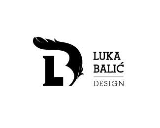
My personal logo.
The "B" letter in negative space is made of feather and two ink bubles (or drops).
I wanted to incorporate feather in logo because feather was first design tool.
First version here: http://logopond.com/gallery/detail/148262
Help me choose the right one. Your comments are very wellcome, thanks!
Status:
Work in progress
Viewed:
9896
Share:


Lets Discuss
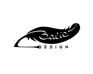
After considering some good advices from this awsome community, and trying out dozens of variations I came up with this.**I got rid of %22L%22 letter, and it seems that %22D%22 also ran away with it, but I'm very happy with this. I also made white lines on feather a bit thicker for better visibility on smaller sizes.**Thank you all, especially @nathantrafford, for usefull and constructive comments!**So, what do you think?
Replythis is looking good, balic. perhaps make the ink spots more loose and splattered? i had no idea what they were unless i read your description.
ReplyHey now this is really starting to look nice! I immediately see a B, and love the idea of using ink! I'm glad you're not worried about the D as it's secondary (and because it's secondary, it should really be smaller than the most important letters anyway, but that's a different conversation). Some will probably comment on how they typography below should be a sans serif to match the feel of the B above, but I love the classic feel of this face (garamond?). You could make a really cool ligature that connects the accent of the c to the dot of the i.**As far as the ink droplets go, it is a little tough to see at first, but the idea is there and i think it just needs a little playing with, maybe adding a couple of sporadic small drops nearby or connected to the bigger drops, as colin suggested. I like that they are perfectly round, because that's usually what happens with that thick black ink as opposed to being splattered. I think the highlights on these 'bubbles' could move so that the light is hitting from the top left instead. **Last thing I would suggest is seeing what the word DESIGN looks like in a sans-serif. It may not work at all, or it may help it out.**This is turning out great! Nice work!
Replythis one is the best :) ! Congratulations ! :) what about trying to play a bit with proportions of the mark and the text ? :)
ReplyThank you all for constructive comments and support!**@Colin : I tried all kind of drops and feathers and it doesn't work, it looks confusing and destracting. Thanks for comment!**@nathantrafford : I'm glad you like Serif. I also had second thoughts about Sans but Serif has some personality, and Sans looks more business-like (and somehow cold, without emotion if you know what I mean... sounds silly maybe, but that's how I see it :) ).It's Gentium Basic. *I usually like ligatures but I think this one might get in the way of feather and be destracting. If the logo would be basically text , ligatur would lighten it up.*I like the light on drops this way because first thing after seeing the B, my wife said: %22this drops look like smiles to me%22 :D *That didn't occur to me but smiles are positive so why not keep them?*Now they look to me like happy drops :)*I tried sans DESIGN and it doesn't look good.*Thanks a lot!**@heavy_designer : As you said %22you must be carful not spreading to much details in here %22 - that thought is circling in my head all the time. Maybe the dot on %22i%22 will work.*Thanks for support!**@jands: Thanks man! I tried dozens variations and only this one makes me happy.
ReplyCheers, mate. This is definitely the way to go. There's a strong concept here, and it's executed fairly well, although, with a bit of polishing up, you can launch this from %22pretty good%22 to %22really great.%22**I definitely agree with both Colin and Nathan%3B those ink droplets are too perfect. I honestly believe that most people won't get the association without an explanation. I know you said you've tried their suggestion, but I think you need to try harder. You have to *make* it work, or else the concept fails, and it's time to try something else.**Look at this as a design problem that needs a solution. How do you convey your concept to people without having to explain it? People need to know just by looking at it that those dots are ink blobs. And ink blobs are not this perfect. But, of course, as you've already experienced, going too far with the splotchy look will be confusing and messy. I think you need to find some type of middle ground.**One other thing I would suggest: You're definitely on the right track with the feather, but I feel like it looks just a tad awkward on the B side. It looks too forced an unnatural, and therefore, it feels like you're trying too hard to push this concept. If you look at the best examples of clever logos, one thing you will notice is that they look effortless. Natural. Like they were *meant* to be that way. This is what you should be aiming for.**Again, getting back to how you can catapult this idea into %22really great%22 territory, I think you'll find that if you spent a day (or however long it takes) sketching a feather so that it bends and curves to form the two bowls of a B *in a natural way*, you'll arrive at a solution that works a bit better than what you have.**I floated this, because I believe in the concept, but I would love to see you push yourself a bit more on the execution.
ReplyPlease login/signup to make a comment, registration is easy